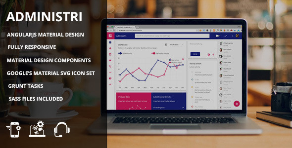
If you’re an AngularJS developer and you need to streamline your app development with awesome design, you most definitely need to check out the material design for AngularJS. The post highlights all the benefits the design has to offer. The first thing that is most likely going to catch your eye is that the design is extremely neat and attractive. The Administri design has pre-designed components for all sorts of administrative panel blocks and features.
Video: Material Design for AngularJS
Dashboard
The design pack comes with three types of dashboards: just plain dashboard, analysis-focused and tailored for social media. These dashboards have some of the components that design comes bundled with. Let’s take a closer look at the design components and see what’s so cool about each of them.
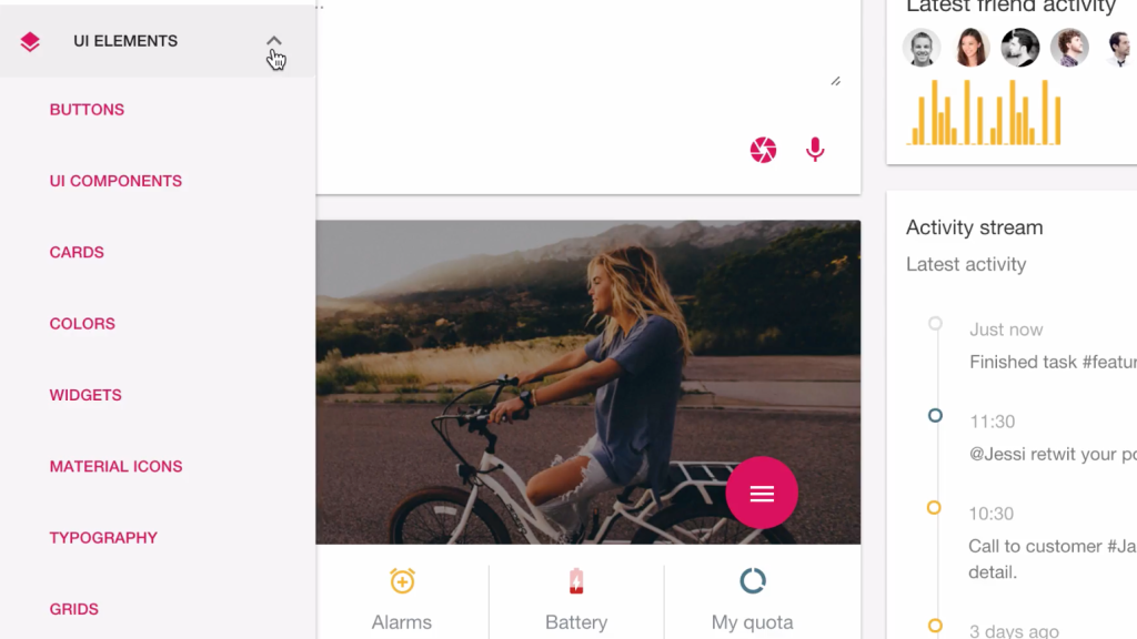
UI Elements
The material design for AngularJS has the following UI elements that you’ll be able to easily use for your needs: buttons, UI components, cards, colors, widgets, material icons, typography and grids. You can easily hook them up in your own app so that they perform the actions you want them to. First let’s take a closer look at the available buttons.
Buttons
Buttons are included with the .md-button directive. You can make all sorts of buttons, ranging from links to raised and not raised buttons. Disabled styling can be done using ng-disabled=”true” attribute. You can also make use of fabs. Speaking of which …
Fabs
Fabs are an amazing and very functional style of buttons. They can be used pretty much anywhere to give quick actions to the user. Fabs can be inserted using class=”md-fab” and inserting an SVG icon inside. A collection of material design SVG icons comes bundled with the theme.
Speed dial fabs
The speed dial fabs are fab-style buttons that reveal more options once you hover over or click them. You can choose from 4 direction modes, such as Up, Down, Left and right. Other than that, it’s possible to choose from two animation modes, which are md-fling and md-scale.
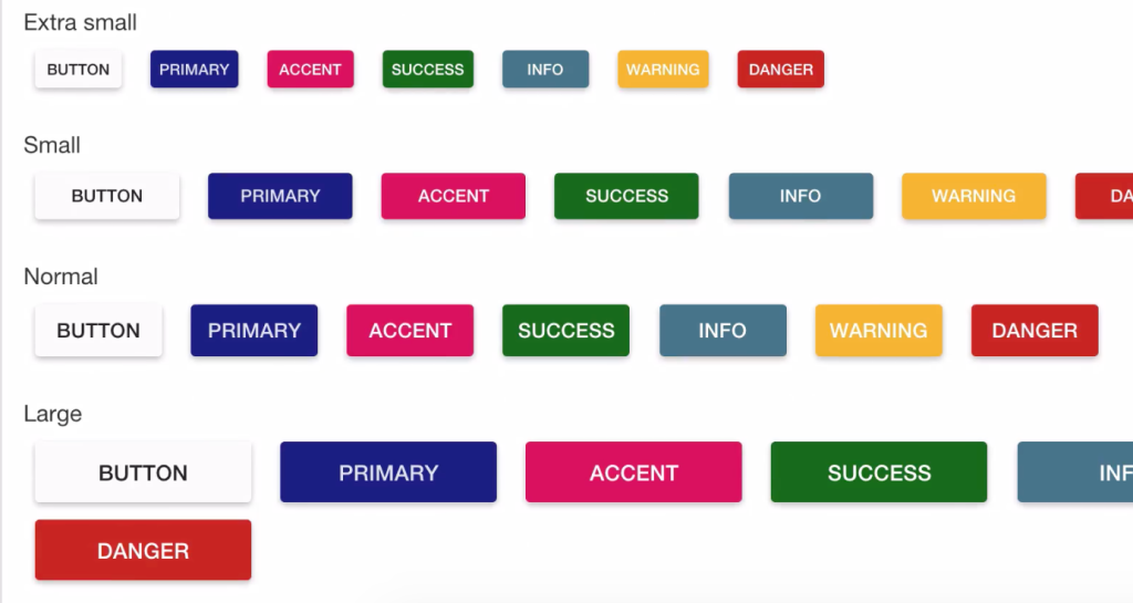
Button Sizes
It goes without saying that you’ll also be able to resize your buttons as you see fit. You can apply different classes to your buttons to achieve the desired height and width for your buttons. These classes are btn-sm, btn-xs, btn-lg or no class for the default height. So your buttons can be extra small, small, normal and large.
UI Components
The UI components section of the material design for AngularJS has the following components built-in: bottom sheets, contact chips, progress circular bars, toasts, awesome Md app, tabs, fab speed dial, chip elements, dialog, linear progress bars, toolbar shrink, fab toolbar and static tabs.
Bottom Sheet
You can show a bottom sheet using the service $mdBottomSheet. You can show your sheet as a list or as a grid. You can dismiss your bottom sheet with the service or a swipe down.
Contact Chips
Contact Chips work like tags with contact pictures that you can add to any text field. They are displayed with a nice style and can be inserted or removed.
Circular Progress Bar
You can use determined progress bars and indeterminate progress bars using the directive md-progress-circular. For operations where the percentage of the operation completed can be determined, you want to use a determinate indicator. They give users a quick sense of how long an operation will take.
For operations where the user is asked to wait a moment while something finishes up, and it’s not necessary to expose what’s happening behind the scenes and how long it will take, use an indeterminate indicator in that case.
Toast
You can use the following position options for your toasts: bottom, top, left and right. Toast can be dismissed with a swipe, a timer, or a button.
Awesome MD App
The tooltip is visible when the button is hovered over, focused, or touched. Additionally, the tooltip’s md-visible attribute can use data-binding to programmatically show/hide itself.
Tabs
Use the directive md-tabs and md-tab to create awesome tabs with animation when scrolling. You can bind the selected tab via the selected attribute on the md-tabs element.
Fab Speed Dial
You may supply a direction of left, up, down, or right through the md-direction attribute. Other than that, you can use either the md-fling animation mode or the md-scale one. Note that you can also hover over the directive’s area or tab through each button to open and activate the speed dial menu.
Chip Elements
Chips work like tags that you can add to any text field. They are displayed with a nice style and can be inserted or removed. You can use a custom chip template or the default one. Other than that, you can even use placeholders and override hint texts.
Dialog
You can show a Dialog using the service $mdDialog. It allows you to open a dialog over the app’s content. You can press Escape or click outside the dialog to close it and send focus back to the triggering button.
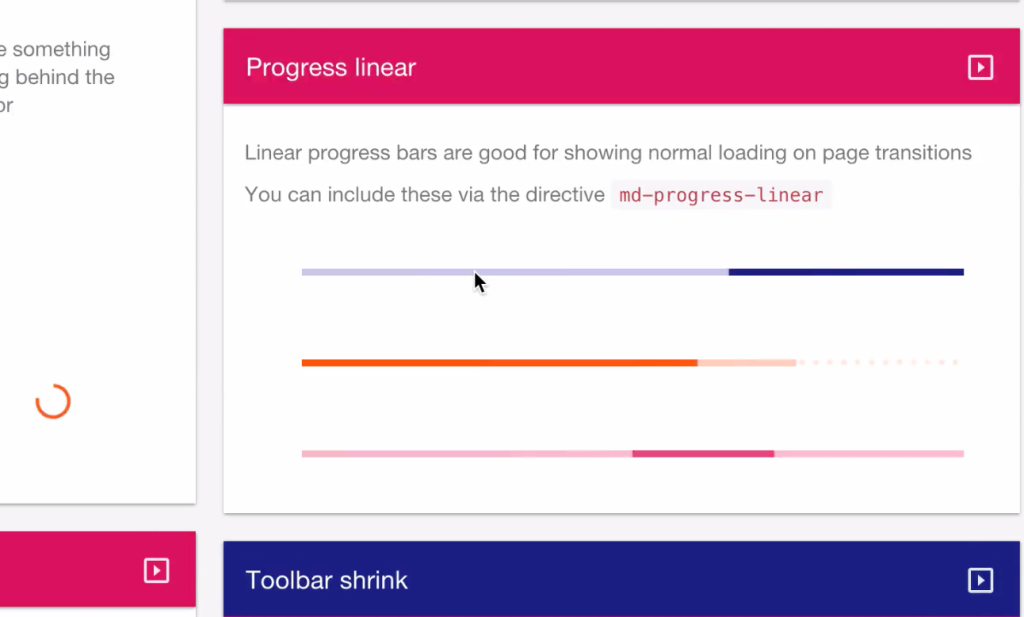
Linear Progress Bar
Linear progress bars are good for showing normal loading on page transitions. You can include these via the directive md-progress-linear.
Toolbar Shrink
The Administri design comes with the toolbar shrink feature as well. The bar disappears in a really neat way.
Fab Toolbar
You can use the fabToolbar with a trigger and regular toolbar. You may use the md-open attribute to programmatically control whether or not the control is open, and you may set the direction that the toolbar appears using the md-direction attribute. This component currently supports the left and right options.
Static Tabs
It goes without saying that you will also have a static tab design ready to use. You can modify it to meet your needs as well. Moving on to the next item in the UI Elements drop-down menu.
Cards
The Administri design pack comes with multiple card designs, which are readily available for immediate use.
Colors
The same holds true for colors. By default your Angular Material application will use the default theme. The default theme is pre-configured with the following palettes for intention groups:
- primary – indigo
- accent – pink
- warn – red
- background – grey (note that white is also in this palette)
Configuring of the default theme is done by using $mdThemingProvider during application configuration.
Widgets
The Administri design pack also comes with a set of widget designs that you can modify and use for your project.
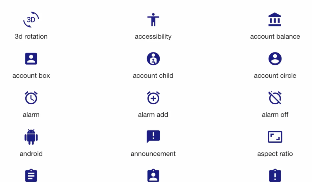
Material Icons
The material design for AngularJS also allows you to choose from a plethora of material design icons.
Typography
Plus, the design comes with matching typography, which adds even more appeal to your design.
Grid
And last but not least. The Administri material design also has a grid system built-in. That makes your design process by a long shot easier and the result is just bound to be stunning and state-of-the-art.
Material Design for AngularJS and Custom Pages
The pack also comes with a few pre-designed custom pages, such as profile, login, signup, forgot password, contact, 500 and 404. You can just modify them as you see fit instead of creating everything from scratch.
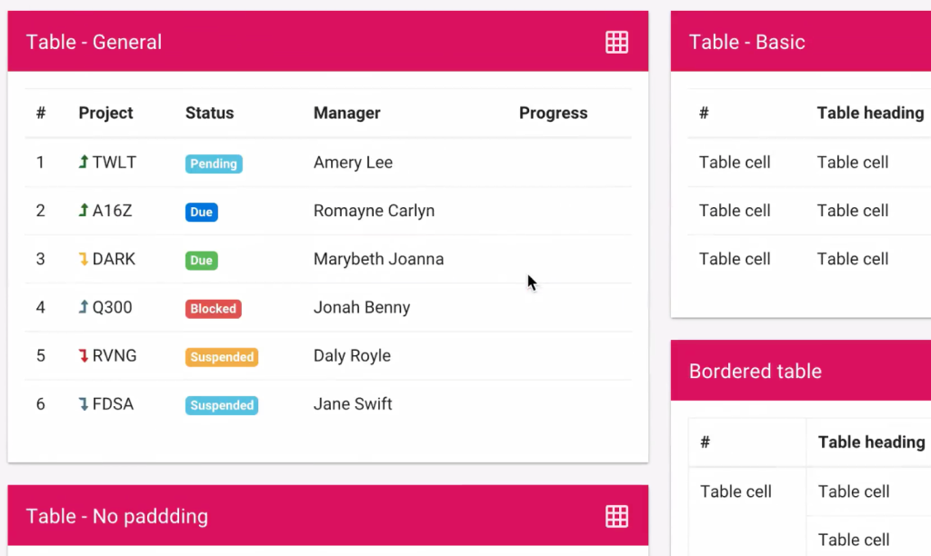
Tables Styles
You can also make use of 3 predesigned table styles: static tables, responsive tables and dynamic tables.
Form Elements
The material design also comes with all sorts of form elements to simplify your life as a web developer. Other than that, you’ll have access to a few form designs with validation built-in.
Charting in Material Design for AngularJS
You can also make use of different kinds of charts, such as flot charts (line chart, realtime chart, area chart, stacked bar chart, pie chart and doughnut chart), Chart JS (Line Chart js, Bar Chart js, Radar Chart js, Polar Chart js, Pie Chart js and Doughnut Chart js), Morris charts (Line chart, Area chart) and other charts.
Maps
Another feature that you just can’t do without in up-to-date designs is maps. You can use a standard map, dynamic map and a styled map. Plus, VMAP designs are available as well.
Tasks
And finally you can also use consistent design for your to-do list functionality. You can add tasks, tick them off or delete, view all, view active or view completed. Plus, you can clear completed tasks.
Bottom Line
The Administri material design will allow you to jumpstart your next AngularJS-based project because you’ll be able to just modify the pre-designed UI components that come bundled. Thus, your next project will both work flawless and look awesome. Get the design and start creating more professional applications.
What do you think about the design?


