
In this breakdown of TerminalCleaningServices.com, we’ll examine how the site delivers value through design, messaging, and functionality to create a compelling user experience. From the moment users land on the page to the final conversion touchpoints, there’s much to appreciate — with a few areas ripe for enhancement.
1. Clear, Benefit-Focused Messaging
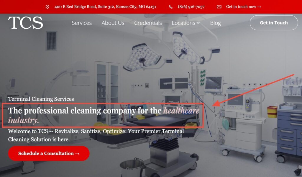
Right away, the homepage delivers clarity and impact with its core messaging:
“Your Premier Terminal Cleaning Solution is here.”
This benefit-focused headline clearly signals the site’s value: a top-tier solution for terminal cleaning — a critical service in healthcare environments. It effectively primes the visitor with what matters most: expertise tailored to their facility needs.
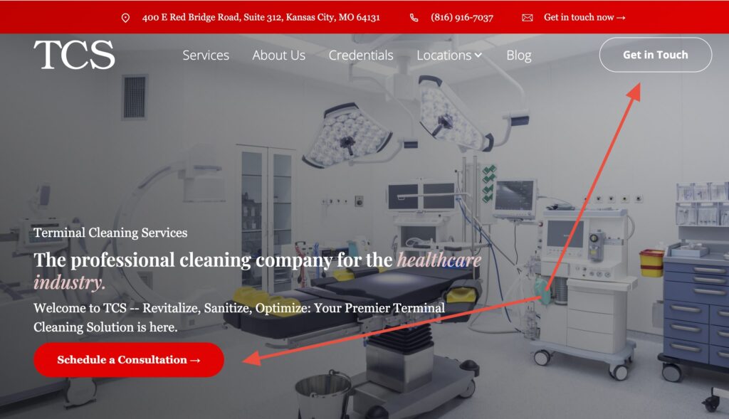
2. Easy First Steps for Users
Visitors immediately encounter two clear options to act without scrolling: the “Schedule a Consultation” button and the “Get in Touch” button in the top navigation.
This combination works well — one CTA drives direct conversions, while the other provides a quick, low-friction way to start a conversation.
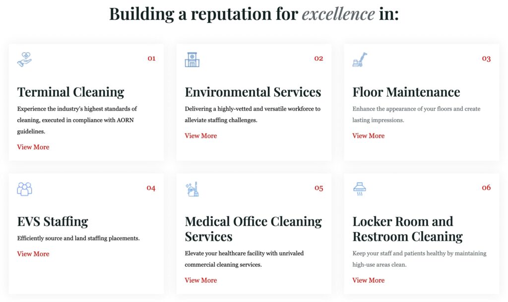
3. Informative and Organized Services Showcase
The site smartly outlines its offerings in a structured, user-friendly way. Key services include:
Terminal Cleaning (aligned with AORN standards)
- Environmental Services (staffing solutions)
- Floor Maintenance
- EVS Staffing
- Medical Office Cleaning
- Locker Room and Restroom Cleaning
This clarity allows prospective users to quickly assess relevance. Visual aids and brief descriptions help reinforce each service.
4. Minimalist, Functional Design
The design presents a lightweight, navigable interface — streamlined and professional. Essential information is easy to find without clutter or distraction.
From the menu labels to the layout structure, the site feels purpose-driven, which aligns well with its healthcare-industry orientation.
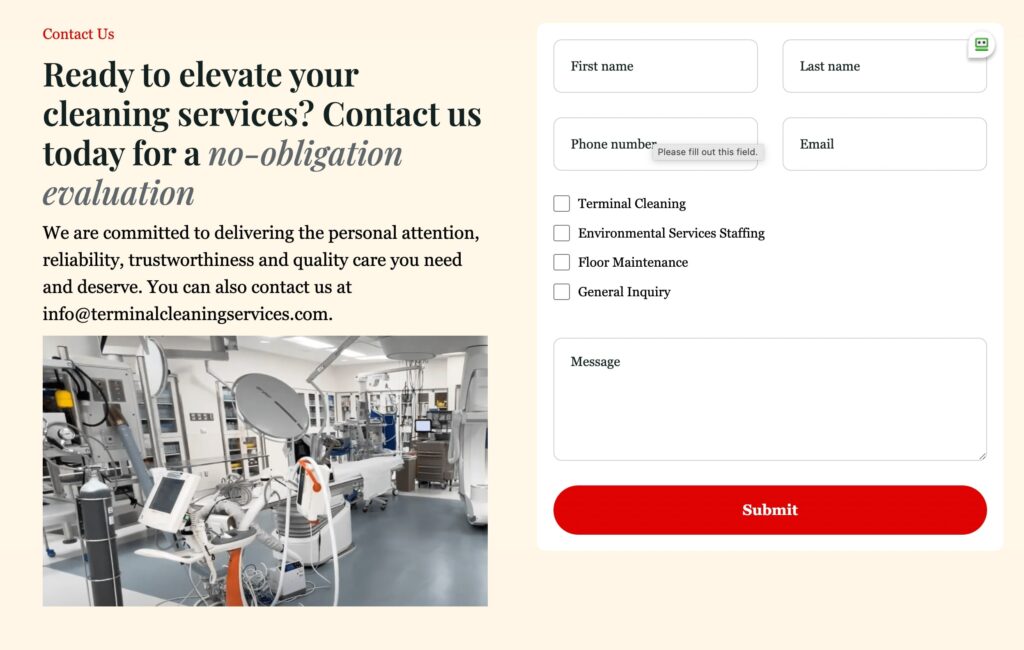
5. Easy-to-Find Contact Options
The contact section is thoughtfully designed: it features a clear headline (“Ready to elevate your cleaning services?”), supportive copy, and a professional image that builds trust.
The form itself is simple, with only the essential fields and checkboxes for different services, making it quick for users to submit an inquiry. Contact details and email are also provided for those who prefer a direct approach.
This mix of options — form, email, and a strong CTA — ensures that reaching out feels easy and approachable, which is key for turning visitors into leads.
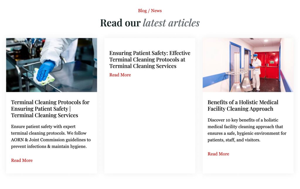
6. Thoughtful Supporting Content
The blog section offers informative, authoritative articles like:
These resources reinforce the brand’s expertise and help with SEO and visitor engagement.
Overall Verdict:
TerminalCleaningServices.com provides a solid, professional first impression and clear pathways to conversion. With the addition of social proof, stronger visuals, and conversion flexibility, it could become the go-to digital presence for healthcare-grade cleaning services in its market.