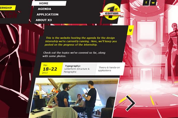
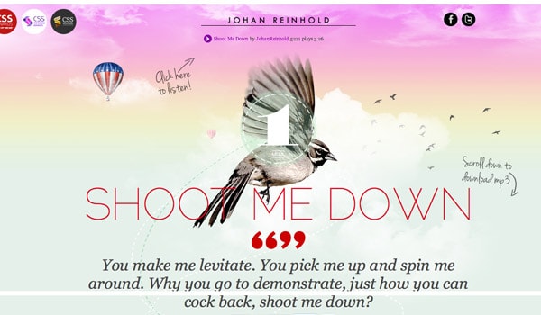
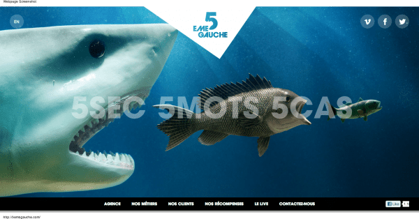
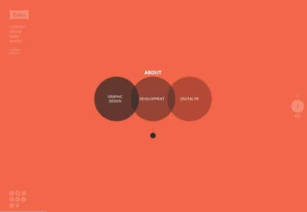
If you want to add a parallax scrolling effect to your WordPress background in an easy way, search no more. I’m going to show you how to do that without messing around with any code whatsoever. You’ll have to just copy and paste in order to implement it. That’s about it. Let me point out one aspect of the post in the first place. Even if you don’t need to add this functionality to your site now, I strongly recommend bookmarking it because chances are that you’ll need to do it (use the effect) down the road because the technique is gaining popularity. One day you may have a customer who says, “Dude, I want that parallax thing in my site’s background. And I need it asap. Like tomorrow”. And guess what? Using the step-by-step instructions from the post that you’re reading now, you’ll be able to actually do it within a few minutes. So, you may want to bookmark it even before you finish reading the article so that you don’t forget later.
Parallax Designs You Gonna Love
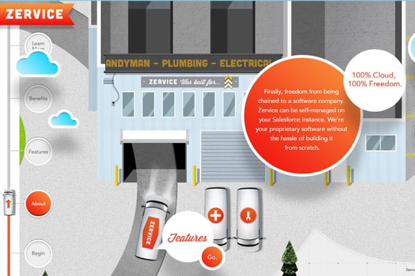
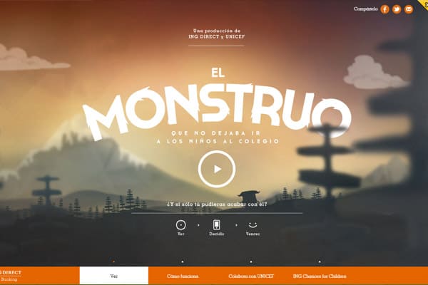
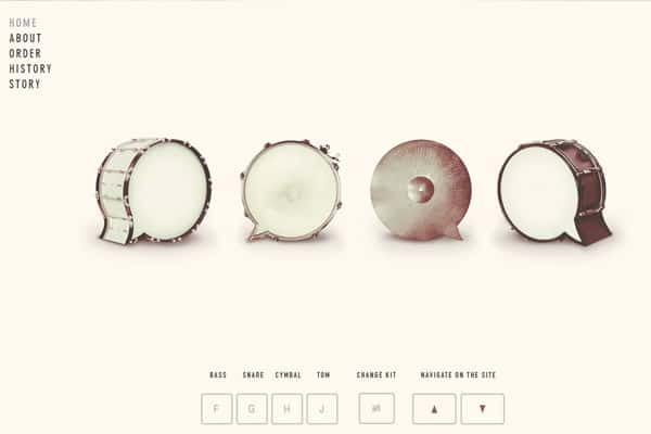
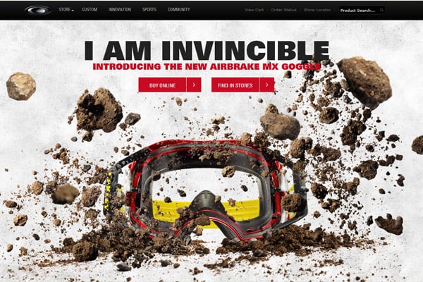
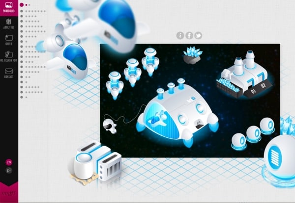
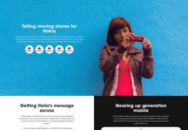
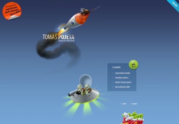
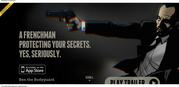
Before we go any further, let’s take a look at what amazing things can be done with parallax scrolling. By the way, these designs are for sale so you can choose the one you like best and make your site look just like that. Click the design you love!
Cutting Edge Responsive Parallax Template
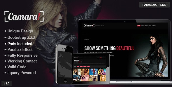
Camara – Responsive Parallax Single Page Template
Surreal – Responsive Parallax One Page HTML5
Venus – Responsive/Parallax/Retina Ready Template
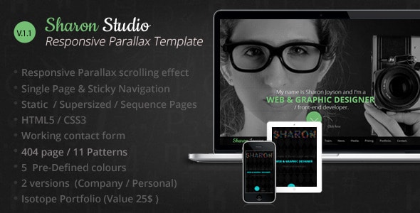
Sharon Studio Responsive Parallax Scrolling
Eleven – Responsive One Page Parallax Template
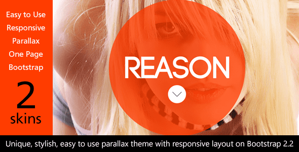
Reason – HTML5 Responsive Parallax on Bootstrap
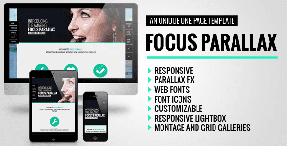
Focus Parallax One Page HTML Template
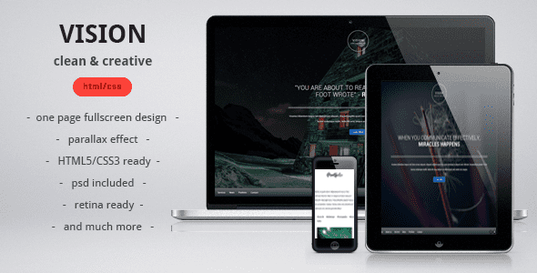
VISION clean, creative, parallax one page template
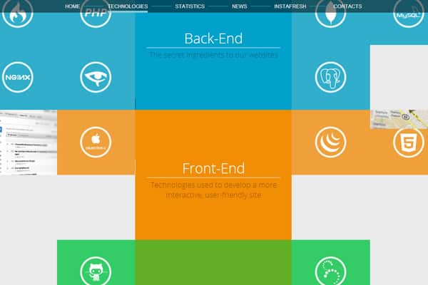
Afresh – Parallax Responsive Creative Portfolio
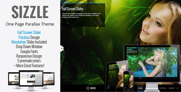
Sizzle – OnePage Responsive Parallax Theme
Kutcher Studio – Responsive Parallax Template
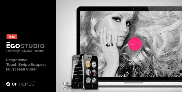
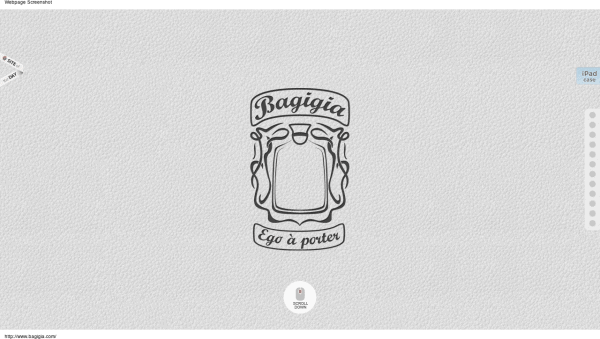
Ego Onepage Responsive Parallax Template
Persona – WordPress Creative Responsive Parallax
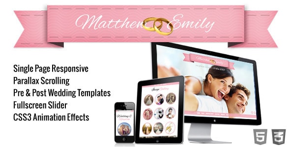
Take the Plunge Parallax Responsive Wedding
Why Parallax Scrolling Sux in Terms of SEO
Sure thing, this paragraph can actually discourage about using the parallax scrolling tutorial below, but as an SEO dude I just can’t be silent about it. And if you read the paragraph to the end you’ll see that it’s not that bad, actually. So, it’s kinda a little grain of salt for you. 🙂 Here’s the deal.
But first watch this YouTube video where Matt Cutts is being really obscure about one page sites.
Though this parallax scrolling tutorial is supposed to create a slick parallax background for your site, it’s not really a good idea from an SEO standpoint. And what really sux, pardon my French, it’s the case in most cases. The thing is that parallax means using a single HTML doc (html page or file) for all the content that you want to put on your site. You’re pretty much “forced” to stuff all your content in one page. Long story short, you put all your eggs in one basket. And as we know, it’s bad practice. Here’s why:
- it’s just slowing down your site, because parallax sites have all the images in one html doc. And if you care about your site’s performance in search engines, it’s a big problem because loading time is getting more and more important as a ranking factor. So, the slower your site the less chances for ranking #1 for your keyword.
- that would be really hard to optimize such a page for a few keywords, again, because the whole shebang is one page. As a rule of thumb, you want to optimize each page of your site for specific keywords. Using this effect would prevent you from doing that, at least in an efficient way. And that’s one more reason to miss out on paying customers.
- using multiple H1 tags on your page. The best SEO practice is to use one H1 tag per page. You won’t be able to do that either and if you do, your headings (content in H1 tags) will just compete with each other and that will confuse search engines (which H1 tag is the most important?). Believe me, you don’t want that situation on your page.
- the longer the content the lower the keyword repetition will be. Well, it’s not really recommended to do any keyword stuffing, but you do want to mention your keyword at least a few times on your page. And with such a structure (everything in one page), you’ll have to do it way more to show the engines what you’re trying to emphasize. And the result may be really sucky. Most likely, you’ll just add keywords in a very unnatural way, which will give you little points in terms of search engine optimization.
- plus you’ll lose out on meta descriptions and title tags, because you can just use ONE meta description and title tag throughout all your site! That means that you get even less chances that somebody will find your site while searching in Google or Bing, or what not.
- it does not agree with responsive designs, which are another trend these days. You’ll just have to either create separate sites for different devices (iPhone, iPad, etc) or create a really intricate code that would detect those devices and launch the parallax effect for each of them properly.
Now that you know all the drawbacks, let’s see what’s on the positive site. The most obvious benefit would be that your visitors will spend a bit more time on your site, checking out how that parallax thing actually works. So, using the effect will decrease your bounce rate to an extent. Well, yeah, that’s in case you (or your designer) took the time to make that parallax scrolling effect really engaging.
And that’s about it. I don’t really see any other benefits. Do you? I’m actually really surprised that there’s nothing more to add to the positive side of the parallax effect. Hopefully, I’m dead wrong.
Though some companies (such as Nike) can afford using it (people will find their site anyways), you as a small business owner can’t really afford it because you need to lure more customers from search engines.
What’s more, you need to take into account if your design (or just it’s part) is beneficial for the user and helps him to achieve what he came to your site for. And parallax is just a gimmick of no actual and practical value.
But wait, there’s hope. The fact that parallax scrolling effect sites are done with a single page is not what the technology requires. It’s done in one page just because of the web developers laziness or lacks of skills. You can visually keep the same experience but your actual content will be loaded externally from different files, which will kill the main (and perhaps the only) problem that the whole site is actually one large page. So, it all boils down to the fact that YOU CAN USE PARALLAX in your design if it’s done RIGHT.
And one more thing, don’t be afraid to use it as I suggest in the the parallax scrolling tutorial below, because in this case the code is just added to the header of your WordPress site and you keep on using all the multiple pages that your blog has. It’s all safe and good to go.
I actually went the extra mile and created a step-by-step screencast for you that explains how to, firstly, create that parallax effect and, secondly, apply it to your WordPress theme. As a matter of fact, you can use the same method to apply it to any CMS such as Drupal, Joomla or what not.
But before we dive into the actual tech stuff, let me introduce you to the theoretical aspect of the parallax effect that I’m covering in the post. If you just need the actual thing and don’t feel like reading all the theory, feel free to skip the following portion and click this link.
What is parallax scrolling
It turns out that the parallax effect is achieved by just moving different background images with different speed (slower or faster). The ones that move faster seem to be closer to the user, whereas the ones that move slower appear to be way or a bit farther. So, you kind of feel the distance between such images.
Parallax in Real Life (Xmasy Version)
http://youtu.be/kJRRQe4g9rg
Video by mgifford
Background mages may move both horizontally and vertically. Plus if you combine the directions you can make your images move diagonally.
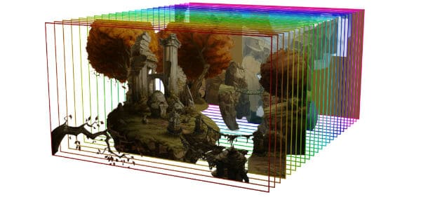
According to Wikipedia, “The technique (parallax animation) grew out of the multiplane camera technique used in traditional animation since the 1940s,[2] and was popularized in the 1982 arcade game Moon Patrol.”.
So, it’s not exactly a new thing, It just changed from cartoon or video games parallax into jquery parallax. And that’s pretty usually the case with most really great inventions or fashion trends for that matter. It’s all the range now and it does not seem that it’ll go away any time soon. So, if you don’t really want to leave money on the table, you better learn some css parallax tricks. 🙂
Why not parallax Flash
The point is that I suggest focusing on jquery parallax scrolling because you can be sure that your desired background will be displayed properly or at all on all devices. Ranging from all sorts of Android gadgets to the iPhone or iPad, which don’t support Flash.
Plus there’s no easy way to add such an effect in Flash. Well, I mean you can surely do that if you’re a Flash guy. No double about that. But what if you just want that effect and you don’t really have that much time to invest in learning a new thing that has a pretty steep learning curve? You just need to use Adobe Flash but you’ll have to learn at least Flash basics before you’ll be able to create a simple parallax animation.
Want some CSS parallax examples?
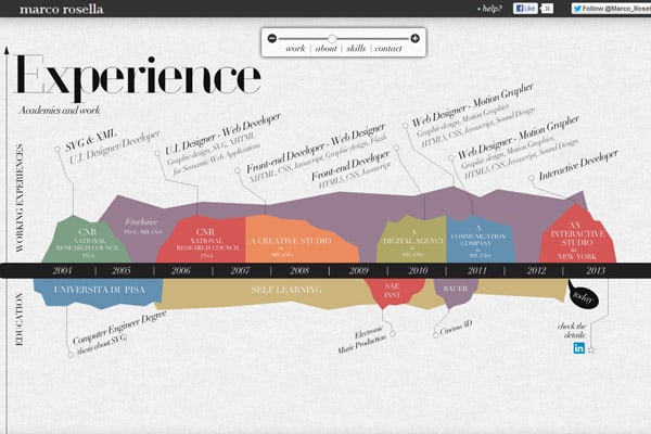
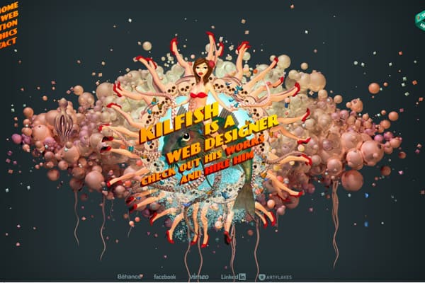
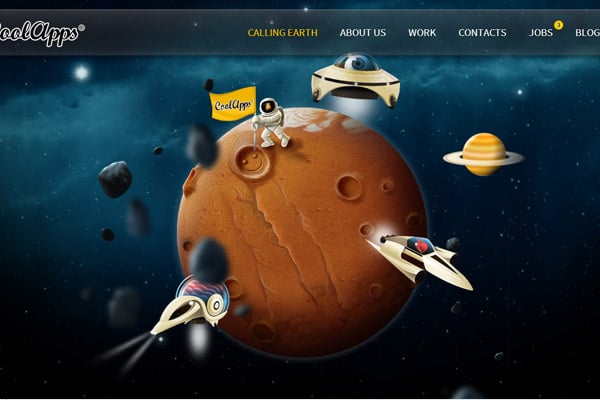
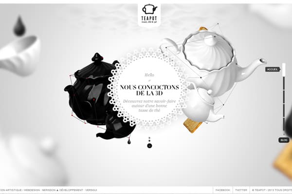
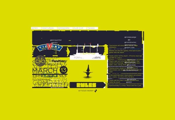
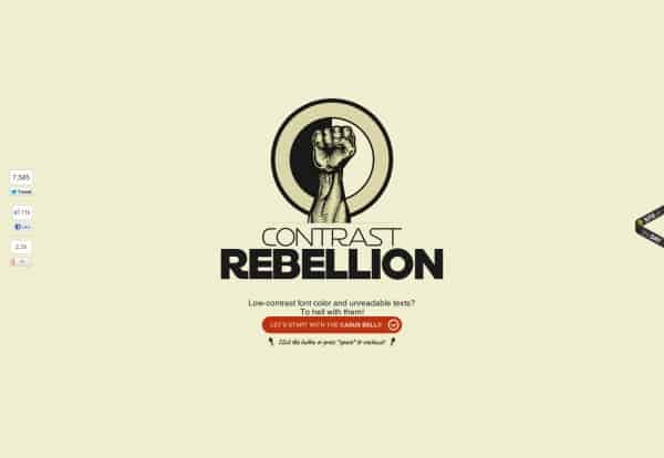
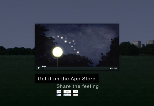
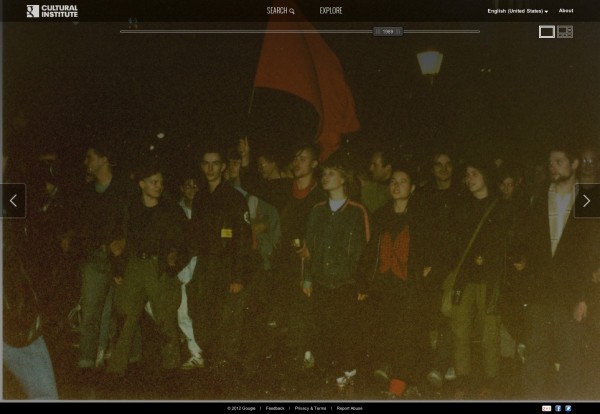
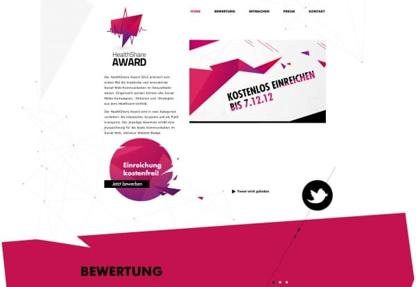
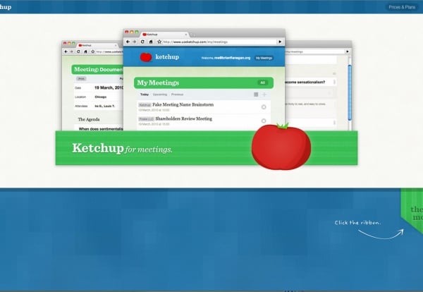
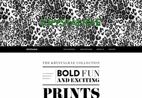
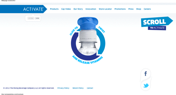
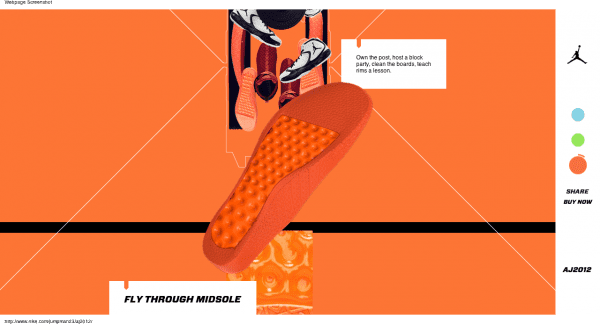
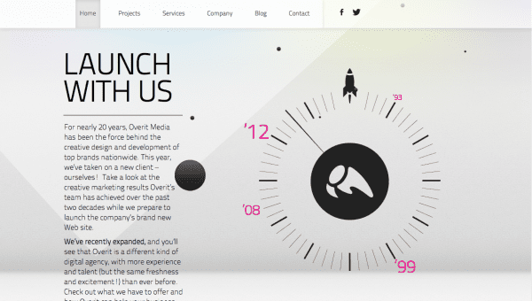
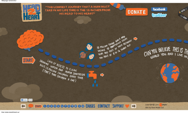
It turns out that there are a whole lot of sites that actually use that technique. And for a good reason. Check this out:
More Parallax Site Resources and Examples
- Mood Indigo
- GravitateDesign
- WebDesignerDepot.com
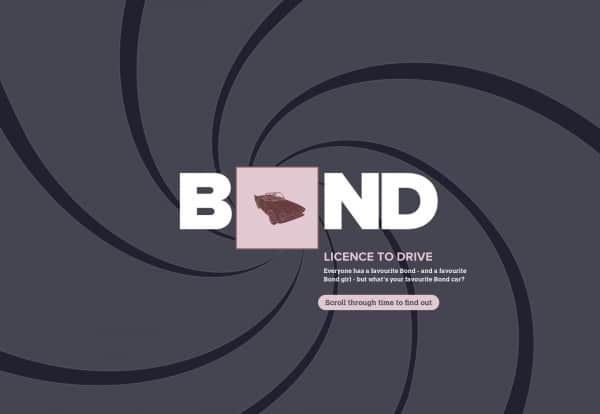
- James Bond: Cars, catchphrases and kisses
- Build a parallax scrolling website interface with jQuery and CSS
- First manned flights
- Parallax Scrolling: James Bond
- Achieve an Extensible, Multilayered Scrolling Parallax Effect in Minutes
- How to implement the parallax scrolling effect, part 1
- Adobe Muse: Parallax Scrolling June 2013
- Hyperstarter.com
- Melanie-f.com
- Urban-walks.com
- Melaniedaveid.com
Let’s Watch Some jQuery Parallax Movies
If you’re new to the effect and not exactly sure how it looks and what it does (‘coz I personally did not catch it at first sight), check out the following videos:
http://www.youtube.com/watch?v=EMedUxYfr-c
http://www.youtube.com/watch?v=p85hl4wesuQ
http://www.youtube.com/watch?v=h0hHDOOFQMc
http://www.youtube.com/watch?v=siYz4qJAYjo
The parallax scrolling screencast
Though I know a whole lot of people who say that they like textual how-tos more, I still believe that there are way more guys out there who really appreciate watching a video about how to do something. So, I’m going to provide you with both textual and video how-tos so that you can learn how to add a parallax scrolling effect to your background the way you prefer..
So let’s first and then I’ll walk you through in text mode. 🙂
Step-by-Step Transcript for the Parallax Scrolling Effect Screencast
- Go to Web-Features.net
- You’ll see two options to create your first effect of this sort, choose the first option (‘Full Scale’ Animated Background) because we want to keep things as simple and easy as possible.
- Now, you can set the color of your background. You can do it in the Background Color panel. Just click on the color you’d like for your parallax background. In case you’re Ok with the default color, move on to the next step.
- You need to create a new layer so that you can add your objects to it. In order to add a new layer, you need to click the “Create new layer” option in the bottom right corner. While creating a new layer, you can either specify the url to your image (for instance if you uploaded one to your ftp server) or select an image from the available gallery (click the “Show images gallery” option for that). To show you both the ways, I’ll add one image from my server and another from the default images gallery.
- So, while I’m in the “Select image” dialog box, I type in a direct link to my image, which is http://webdesy.com/webdesy-wp/wp-content/uploads/2012/04/webdesy_logo.png
- That done, I click OK and it’ll add my image to the canvas. As you have probably noticed, that image got repeated a few times. That happens because it’s set (in the “Image Mode” panel) to repeat the image both on the x-axis and y-axis by default (the “Repeat Both X/Y” option). If you want to have your image repeated horizontally only, check the “Repeat on the X-axis option. In case you’d like it to be repeated vertically, make sure to tick the “Repeat on the Y-axis” radio button (option). You can also define your desired X and/or Y offset.
- Well, that’s cool but what if you don’t really want to repeat it at all? No problem. Just make sure to tick the “Image” option (you have the “Pattern” option ticked by default). Now you should have just one image.
- You can snap your image to right and/or bottom. Plus you can define its offset as well.
- OK, we’re done with the right-hand panel.
- The left-hand panel allows you to define your image’s behavior. You can make it react to your mouse cursor movements and/or your scrolling.
- First let’s take a closer look at the Mouse Move option. It has 3 settings: Direction, Move on and Speed. The Direction option allows you to specify how your image should move: in the same direction where you move your mouse cursor (click “Forward” for that) or in the opposite one (the “Backward” option). The “Move on” setting makes it possible to specify whether you’d like your image to move on the x-axis, y-axis or both. And the “Speed” text field allows you to specify how fast you want the image to move (up to 10 pixels). Now let’s see the options in the Mouse Scroll portion.
- First let’s take a closer look at the Mouse Move option. It has 3 settings: Direction, Move on and Speed. The Direction option allows you to specify how your image should move: in the same direction where you move your mouse cursor (click “Forward” for that) or in the opposite one (the “Backward” option). The “Move on” setting makes it possible to specify whether you’d like your image to move on the x-axis, y-axis or both. And the “Speed” text field allows you to specify how fast you want the image to move (up to 10 pixels). Now let’s see the options in the Mouse Scroll portion.
- So, you may tick the Mouse Scroll option. By the way, you can either leave the Mouse Move option enabled or disable it by unticking. It’s up to you. The Mouse Scroll feature has the following settings: Direction, Orientation, and Speed. The Direction option allows you to define how your image should move in relation to your scrolling direction (Forward or Backward). The Orientation option empowers you to specify which scroll direction you prefer (Vertical, Horizontal, and Diagonal). And the possible speed settings are exactly as in the case with Mouse Move (up to 10 pixels).
- You can add as many layers (in the “Layers” panel) as you see fit. But I wouldn’t recommend creating too many layers because it can (and most likely will) slow down your site’s performance. And that’s not good in terms of usability and SEO. Judging from my experience with the tool, 3-5 layers seem optimal.
- Now let’s add just one image from the built-in images gallery. Just click on the “Add new layer” option in the bottom right corner. Now select “Show images gallery”. That done, just click on the image that you like to add and hit the “OK” button. You can set it up using the same options that I described while using the previous image.
- Once you’re done with your animation, you can just hit the “Get Embed Code” button. In the “Embed Code” dialog box, click the “Copy to Clipboard” button. It’ll say “Successfully copied” if you did everything properly.
- Now just go to your WordPress admin panel. Expand the “Appearance” drop-down menu, go to Editor. That done, find the “Header” (header.php) option in the right-hand sidebar and click on it. Now just paste the previously copied code somewhere between the <head> and </head> tags. And click the “Update File” button at the bottom. And that’s about it.
- Now you can just go to your site’s home page (front-end in geek speak) and refresh it by hitting the F5 key.
Download the image used in the tutorial (screencast)
In case you’d like to do stuff like that manually, you may want to check out the following tutorial from Net.Tuts+: A Simple Parallax Scrolling Technique
Update:
A creative way to use parallax effect was offered by Matt Foster in his How About SEO for Parallax? post. I really like how innovative Matt’s approach is. It does not require any new snazzy technology and the solution sounds really workable.
Now you know how to easily add the parallax scrolling effect with the help of the builder and your WordPress admin panel. With this trick up your sleeve, you won’t be frustrated if your customer wants this feature on his site. You’ll have another chance to show your professionalism and competence in all things web.
In Conclusion
Though there’s no need to overuse parallax animation (keep in mind that it’s a gimmick in the first place) on your customer’s or your site, certain elements with elegant adjustments can look pretty good and they’ll definitely add some kind of a flavor that your site may be missing so badly. Make sure that adding this feature will not jeopardize your site’s usability because useless snowflakes on a site can get on people’s nerves for sure.
If you have something to say about the topic or in case you’ve got some questions, please leave them in the comments. I’m waiting for them right from the other side of the monitor. 🙂


