In this quick teardown of AttuneConnect.com, I’ll highlight some of the key features that make this website both effective and user-friendly. Let’s dive into the design elements, user experience, and how well the site is optimized for performance and search engines.
1. Benefit-Focused Headline
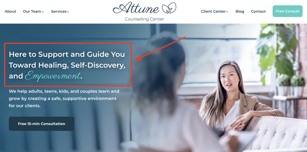
Right off the bat, AttuneConnect.com grabs your attention with a benefit-focused headline. This is an essential feature for any site looking to quickly communicate its value proposition to visitors. The headline is clear and direct, helping users immediately understand what the site offers and why it matters to them.
2. Complementary Hero Image
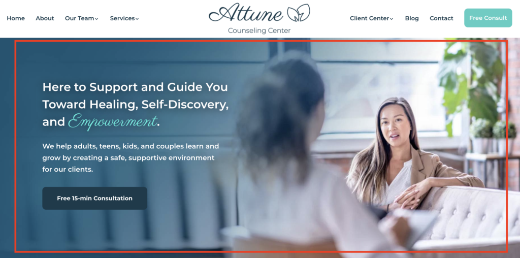
The hero image displayed prominently on the homepage complements the headline perfectly. This is a critical aspect of modern site design, as it not only enhances the visual appeal but also reinforces the message that the headline delivers. In this case, the image aligns well with the site’s purpose and creates an inviting first impression.
3. Lightweight and Fast-Loading Design
One of the standout features of AttuneConnect.com is its lightweight design, which ensures fast load times. In today’s digital landscape, a fast-loading site is not just a matter of convenience but a necessity. Fast sites enhance usability and contribute positively to SEO rankings. AttuneConnect.com gets this right by keeping the site clean and responsive, ensuring a seamless browsing experience.
4. Conversational Language for Better Engagement
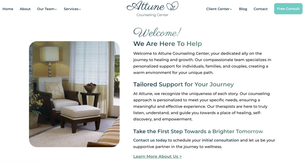
Another excellent feature is the use of conversational language throughout the site. This not only makes the content feel more approachable but also improves usability. Users can easily understand and engage with the content, which is great for both readability and voice search optimization. Sites that use conversational language often rank better in voice search queries, making this a smart move.
5. Clear Sections for Services and Specialties
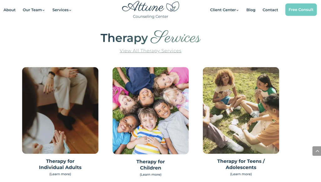
The site features well-defined sections that detail therapy services and treatment specialties. These are prominent and easy to navigate, allowing users to quickly find the information they’re looking for. It adds to the overall convenience of the site, ensuring that users can easily explore the range of services offered.
6. Convenient Contact Information
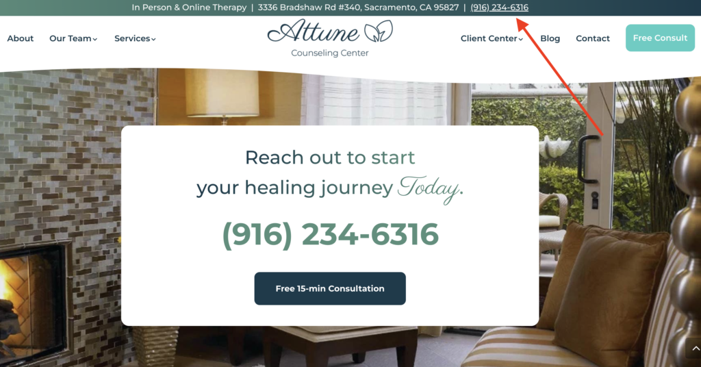
AttuneConnect.com also makes it incredibly easy to get in touch. The contact information, including the phone number and physical address, is prominently displayed at the top of the site. This eliminates any guesswork and ensures that users can quickly find what they need. Having accessible contact details is a crucial aspect of site usability.
7. Thoughtful Use of Call to Actions (CTAs)
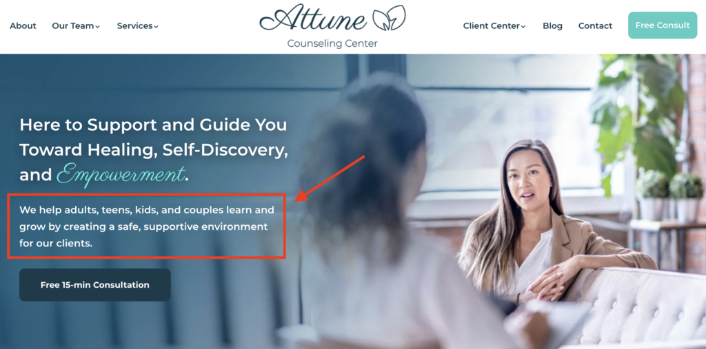
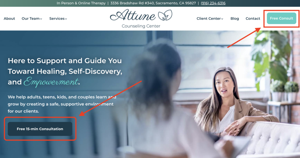
The site’s use of CTAs (Call to Actions) is another noteworthy feature. Strategically placed throughout the site, these CTAs encourage users to take the next step—whether it’s booking a free 15-minute consultation or exploring more services. The repetition of CTAs ensures that users always have an actionable option in front of them, improving conversion rates.
Conclusion
Overall, AttuneConnect.com is a great example of effective web design. The site is lightweight, user-friendly, and optimized for performance. Its clear messaging, fast load times, and thoughtful design elements make it a strong model for any business looking to improve its online presence. With attention to detail and a focus on usability, AttuneConnect.com serves as a fantastic resource for its users.
