In this blog post, we’ll be conducting a thorough teardown of the Angels Partners website, located at AngelsPartners.com. We’ll explore the site’s various elements, including its headline, design, social proof, and overall user experience.
Headline
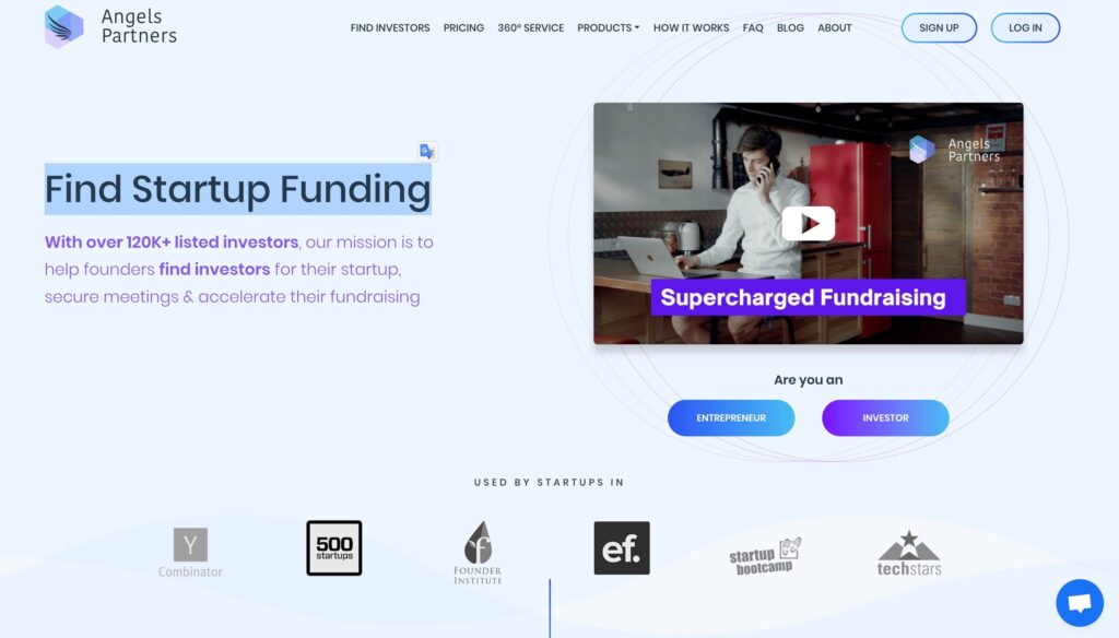
Angels Partners uses a benefit-focused headline: “Find Startup Funding.” This headline immediately communicates the primary value proposition of the site, attracting entrepreneurs and startups looking for funding opportunities. A clear, benefit-driven headline is crucial as it helps potential users quickly understand what they can gain from using the site.
Hero Section
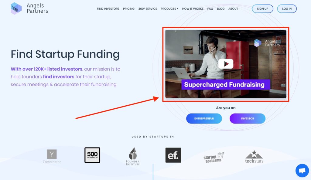
The hero section of the Angels Partners website features a complimentary hero image, which is actually a video. This video provides a visual and engaging way to explain the benefits of the site and how the business operates. By clicking on the video, users can gain a comprehensive overview of what Angels Partners offers and how it can assist them in securing startup funding.
Conversational Language
The site uses conversational language to communicate with its audience. This approach makes the content more relatable and easier to understand. By speaking directly to the users and explaining the benefits in a straightforward manner, Angels Partners effectively engages its visitors and builds a connection with them.
Social Proof
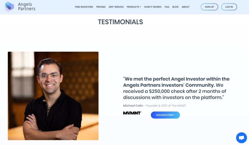
One of the key elements of the Angels Partners site is its use of social proof. Social proof is displayed prominently in the form of testimonials from satisfied users. Each testimonial includes an image, the name of the person, their company, and their feedback. This transparency and authenticity help build trust with potential users, making them more likely to convert.
Step-by-Step Explanation
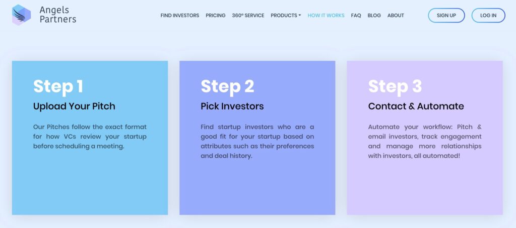
Towards the bottom of the page, Angels Partners explains the steps involved in using their service. This section breaks down the process, making it easier for users to understand what to expect and how to proceed. Clear and detailed instructions reduce any potential confusion and help guide users through the journey.
Additional Social Proof and Call to Action
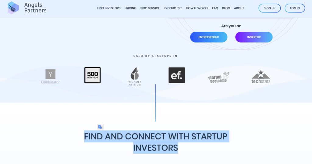
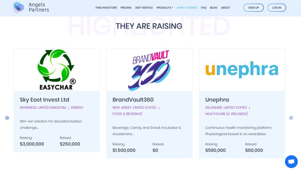
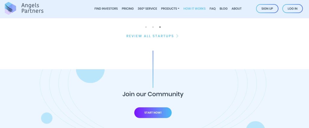
Further down, the site showcases logos of companies they have worked with, providing additional social proof. This not only reinforces credibility but also highlights successful partnerships, encouraging new users to trust and engage with the service. A clear call to action (CTA) is also present, prompting users to take the next step, whether it be signing up, getting more information, or contacting the team.
Contact Information
At the very bottom of the page, Angels Partners includes their contact details. Having contact information readily available is crucial as it provides users with a direct way to reach out with any questions or concerns. This accessibility can significantly enhance user trust and satisfaction.
Design and Usability
The overall design of the Angels Partners website is lightweight and user-friendly. The layout is clean and straightforward, making it easy for users to navigate. A well-designed website that prioritizes user experience is essential for keeping visitors engaged and reducing bounce rates.
Conclusion
In summary, the Angels Partners website excels in several key areas:
- Benefit-Focused Headline: Clearly communicates the main value proposition.
- Engaging Hero Section: Uses a video to explain benefits and operations.
- Conversational Language: Makes content relatable and easy to understand.
- Social Proof: Includes testimonials and company logos to build trust.
- Step-by-Step Explanation: Provides clear instructions on how to use the service.
- Effective CTA and Contact Information: Encourages user engagement and provides accessibility.
- Lightweight Design: Ensures a user-friendly experience.
By incorporating these elements, Angels Partners creates a compelling and trustworthy platform for startups seeking funding. If you’re looking to enhance your website’s effectiveness, consider adopting some of these strategies to improve user engagement and conversion rates.
