
In this post, I’d like to tear down a site that provides healthcare IT support. Firstly, I’m going to share what first reactions and impressions I got on the positive site (what the site is doing really right) and then I’m going to mention what can potentially be improved on the site from a usability standpoint. Well, let’s get the ball rolling 🙂
What They Do Really Well
Compelling and Clear CTAs
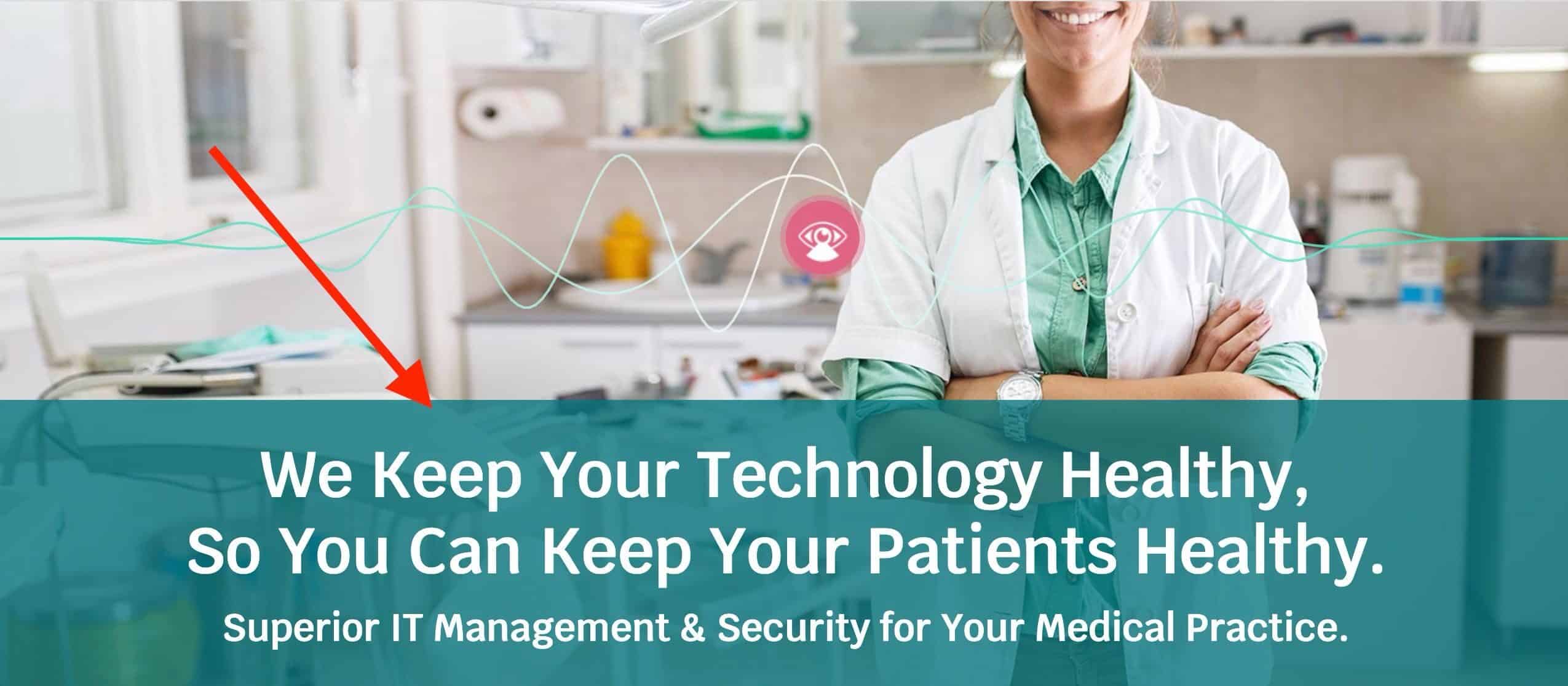
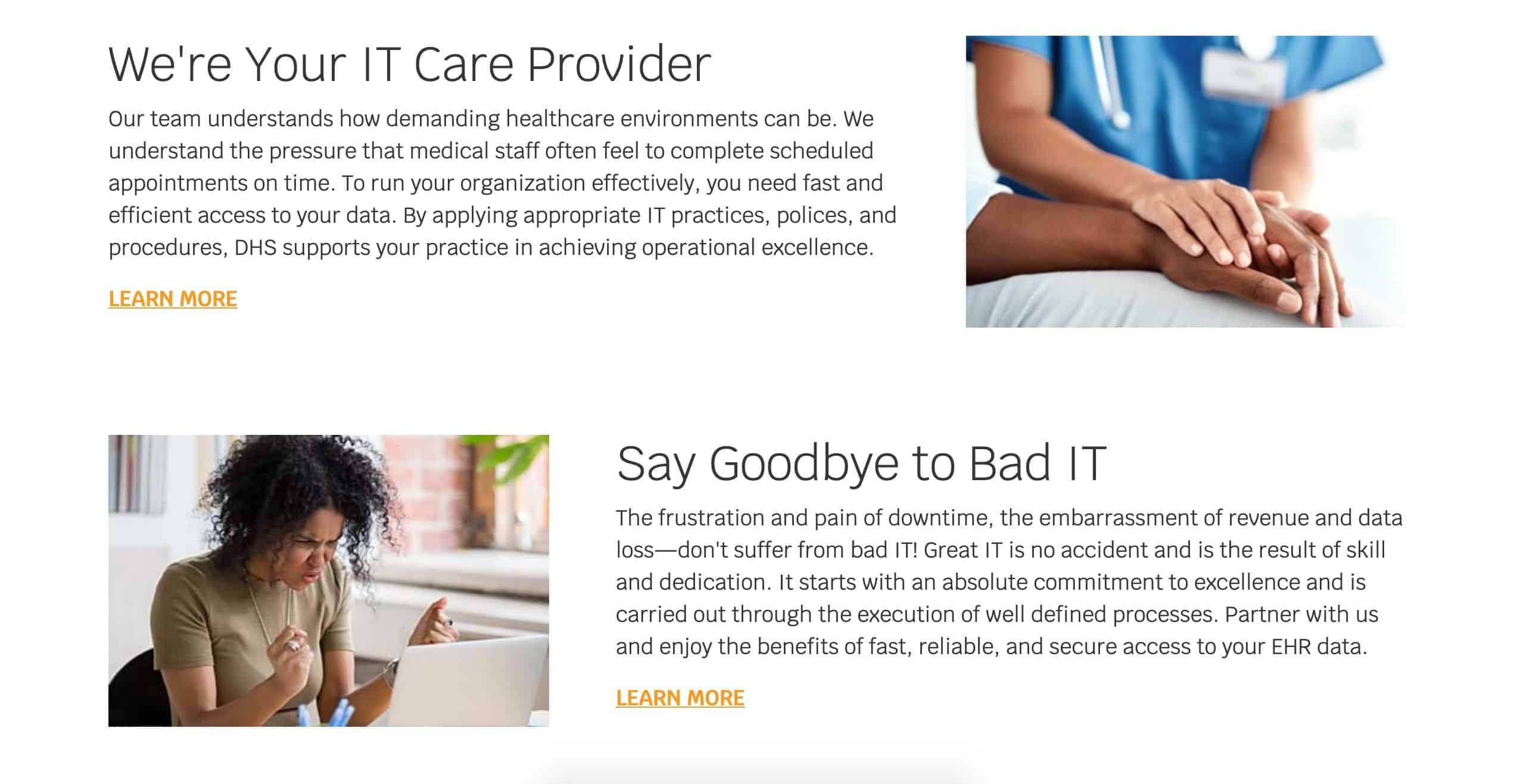
What’s most definitely important when it comes to landing on a site’s homepage is that you want to know as soon as possible whether you’ve come to the right place. Otherwise, you’re just not sure if you’re wasting your precious time or actually you should dwell a bit more and click around. Things are really thoughtfully done on the healthcare IT site. You know right away what the site is all about and what you can do on it within the first seconds you get to the site.
Options to Get in Touch
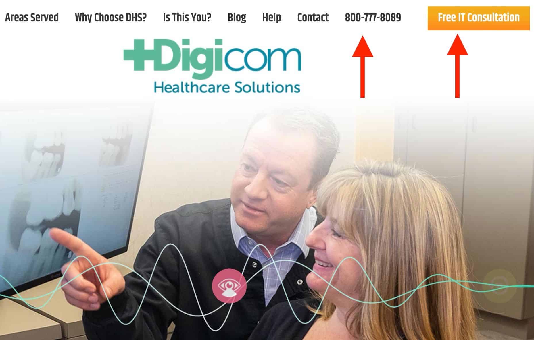
Other than that, you can easily get in touch with them the way that works best for you. The phone number is readily available at the very top of the page and it’ll launch your calling app (Skype, etc) once you click it. In case you don’t feel like talking right away, you can use the Calendly link to the right of the phone number and seamlessly schedule an appointment for when it’s really comfortable for you.
Video Testimonial
One of their clients shares his experience and how the company helped him make his business work smoother and safer in terms of computer network, video surveillance, security, web development, just to name a few). The client talks about what he really likes about the company (such as integrity and the way they practice).
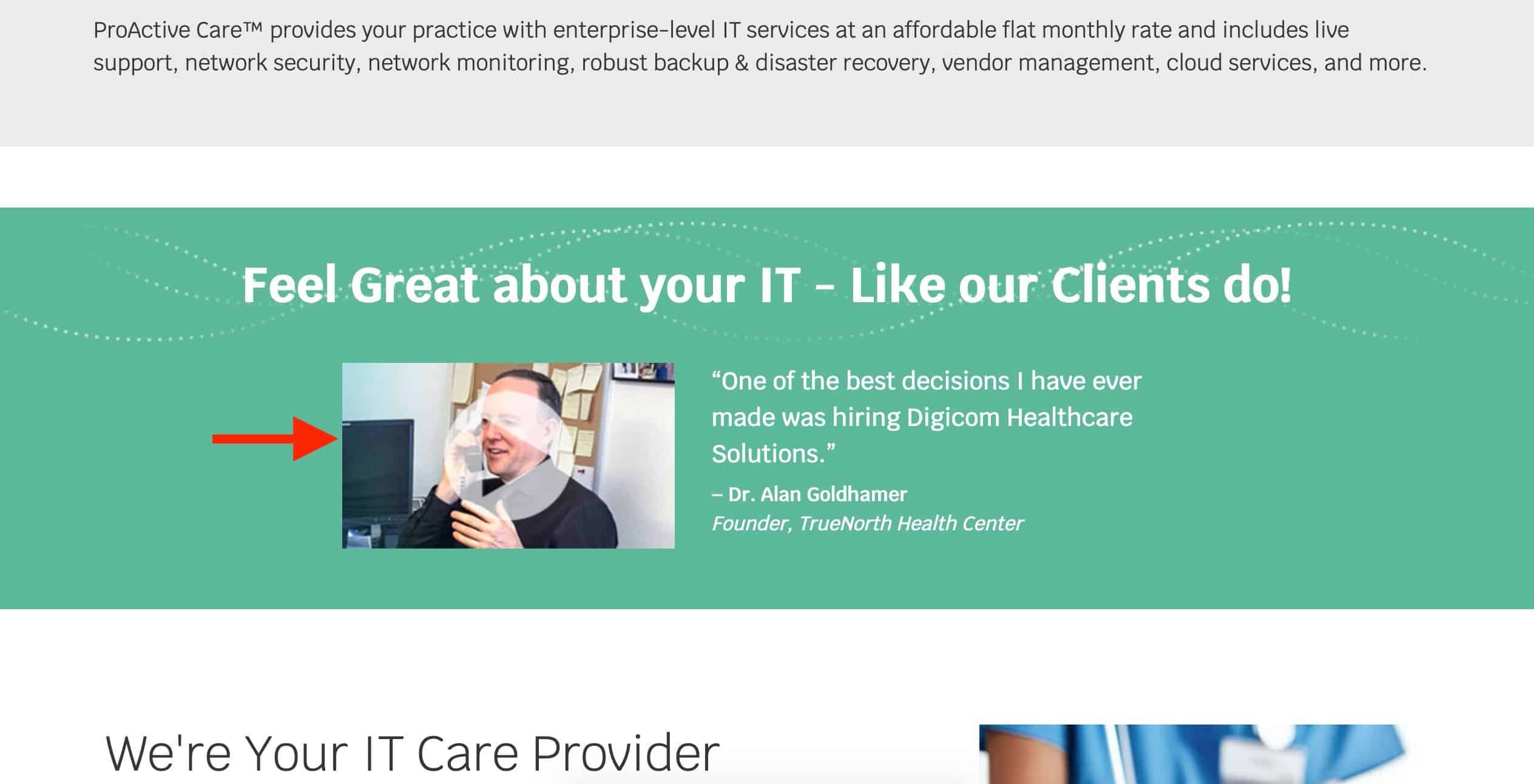
The video testimonial seems to be totally genuine and it’s obvious that the client was absolutely satisfied with the level of professionalism and that, in turn, will most definitely perfectly resonate with their prospects who watch the testimonial. So they ensure to make use of the fact that people like to know what your current clients think about you before they become one of them.
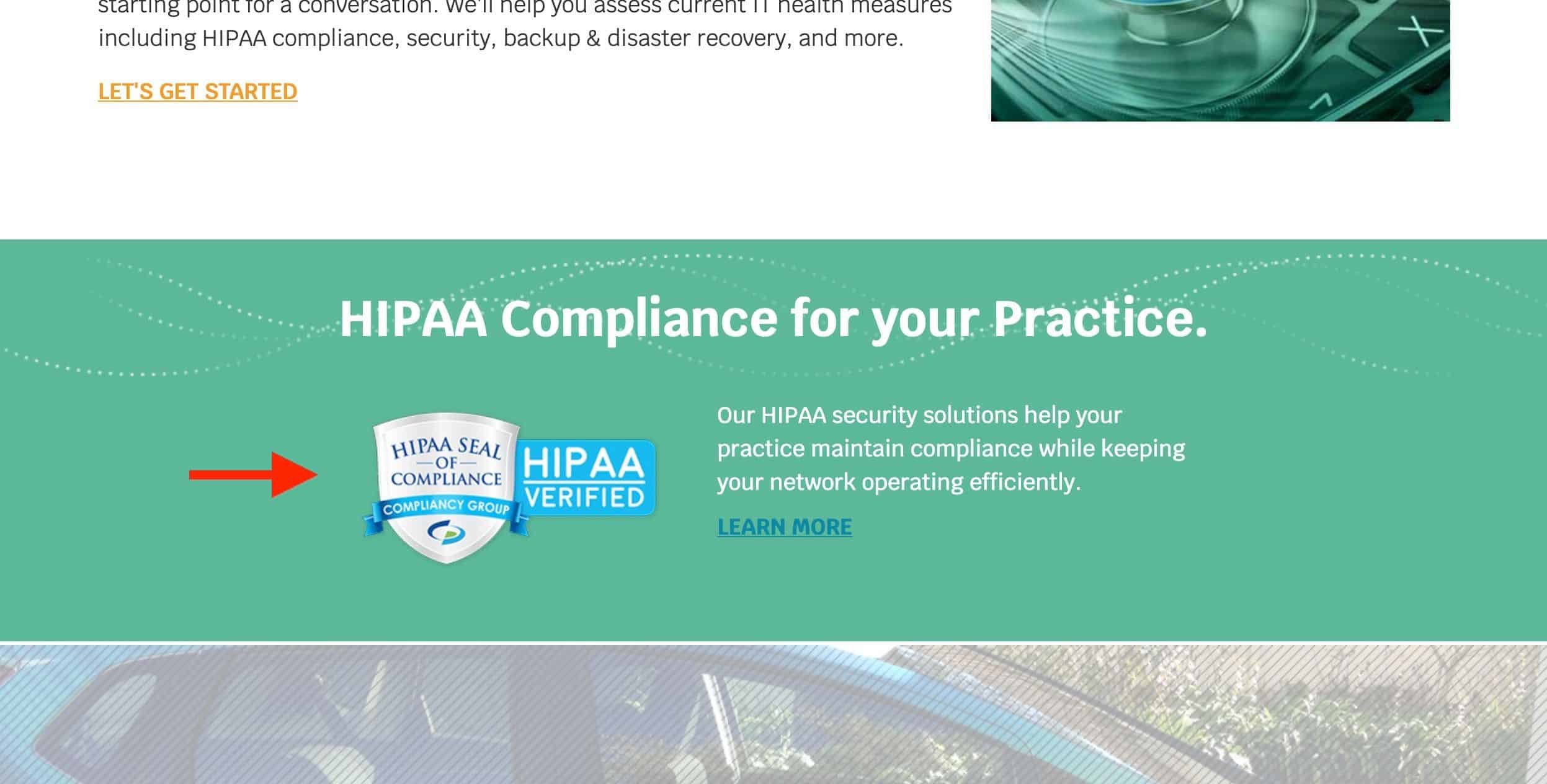
HIPAA Seal of Compliance
Since HIPAA (Health Insurance Portability and Accountability Act) is the top priority when it comes to the healthcare industry and they wisely demonstrate their HIPAA seal of compliance. It goes without saying that doing so will immediately instill trust in everybody who lands on their homepage. Another point for thoughtfulness 🙂
Design
One more reassuring feature is that they seem to be perfectly fine with blank areas on their site, which allows their site to effortlessly breathe. They don’t jampack their pages with tons of useless bits of info but only what their prospects or clients need to find or get to know about. That’s something that surely goes to show that they know their stuff from the web design perspective as well.
Things they could potentially work on
Menu Categorization
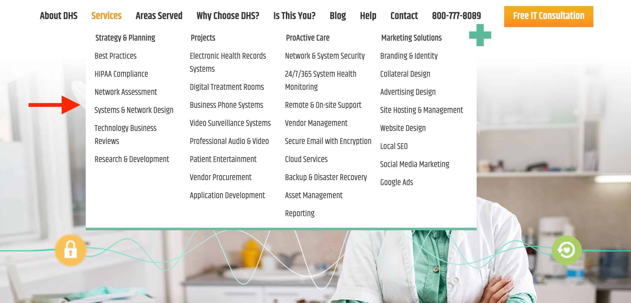
Though they properly did the groundwork in terms of making sure that their most important pages are on the top-most level (such as the “About”, “Services”, ‘Help”, “Contact” pages), it looks that the “Services” drop-down menu may use some work and further (deeper) categorization because you may feel a bit lost and confused when you expand the “Services” drop-down menu.
The Bottom Line
All and all, DHS is doing a great job when it comes to general usability, calls-to-action and design. That especially holds true when it comes to making sure that you make the right first impression because that’s something that can either make or break your online business. The site that I tore down in this post seems to clearly understand what matters most for their customers and prospects.