In this quick teardown of the FiRaConsortium.org website, I want to highlight several key features that contribute to its excellent user experience and interface design. This site exemplifies how to create a smooth, intuitive, and user-focused web experience.
The FiRa Consortium is an organization focused on supporting the development and adoption of Ultra-Wideband (UWB) technology, which enables precise location and ranging for devices and people. They work to promote the development of use cases, ensure interoperability through standards and certifications, and foster an ecosystem for UWB deployment across various industries. The consortium includes major technology leaders and supports innovation in areas such as smart cities, smart homes, and mobility.
Benefit-Focused Banner
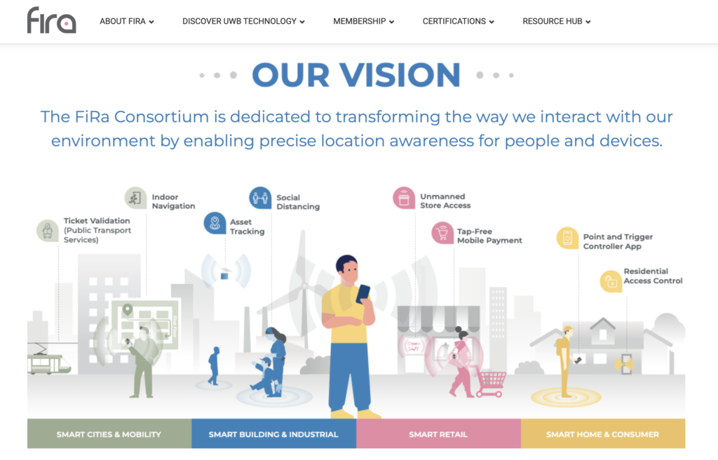
Right at the top of the site, there’s a benefit-focused banner that immediately grabs attention. This banner effectively communicates the various benefits the technology offers, making it clear to visitors why they should be interested. The concise and impactful messaging here sets the tone for the rest of the site.
Informative Drop-Downs
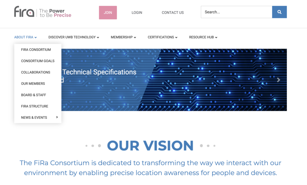
The site features drop-down menus that allow users to easily access more detailed information about the company, its technology, and other relevant topics. This structure not only organizes content well but also empowers users to find what they’re looking for without feeling overwhelmed by too much information at once.
Convenient Search Feature
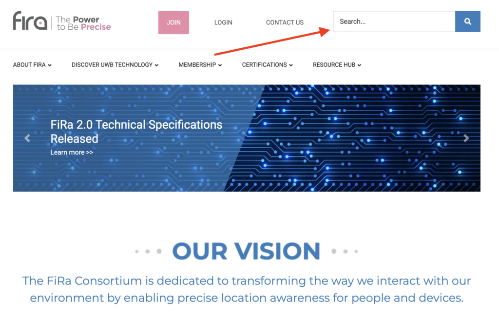
One of the standout features is the convenient search functionality. Whether users are uncertain if a specific item is on the site or they know it exists but can’t recall where, this search tool makes it simple to locate any content. It’s a small but crucial feature that significantly enhances the overall user experience.
User-Focused Interface
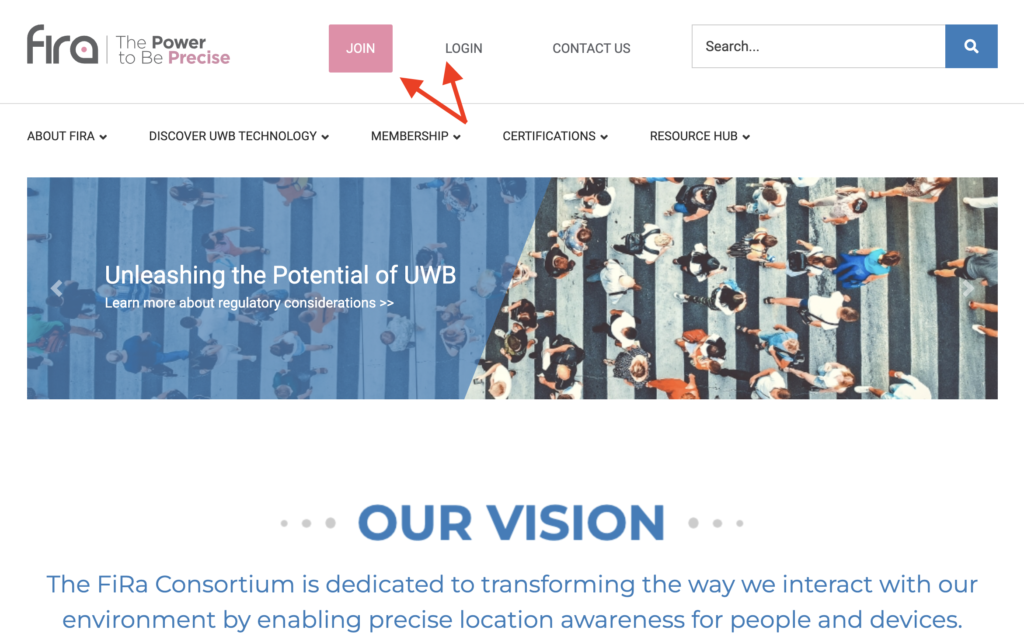
At the very top of the site, you’ll notice that it caters specifically to users who may need to join or log in. The prominent placement of the “Join” and “Login” buttons ensures that these options are always accessible, making the process straightforward for users who want to engage with the site further.
Strong Social Proof
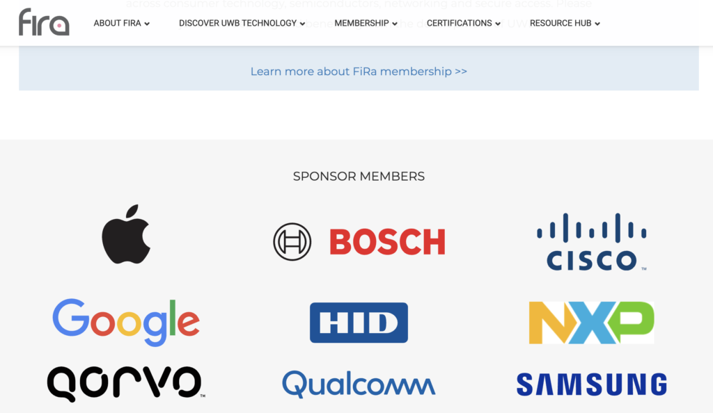
As you scroll down, you’ll encounter a section dedicated to sponsor members, featuring logos from major brands like Apple, Bosch, and Cisco. This social proof is a powerful way to build trust and credibility, showing visitors that Feroconsortium.org is backed by well-known, reputable companies.
Easy Contact and Clear Calls to Action
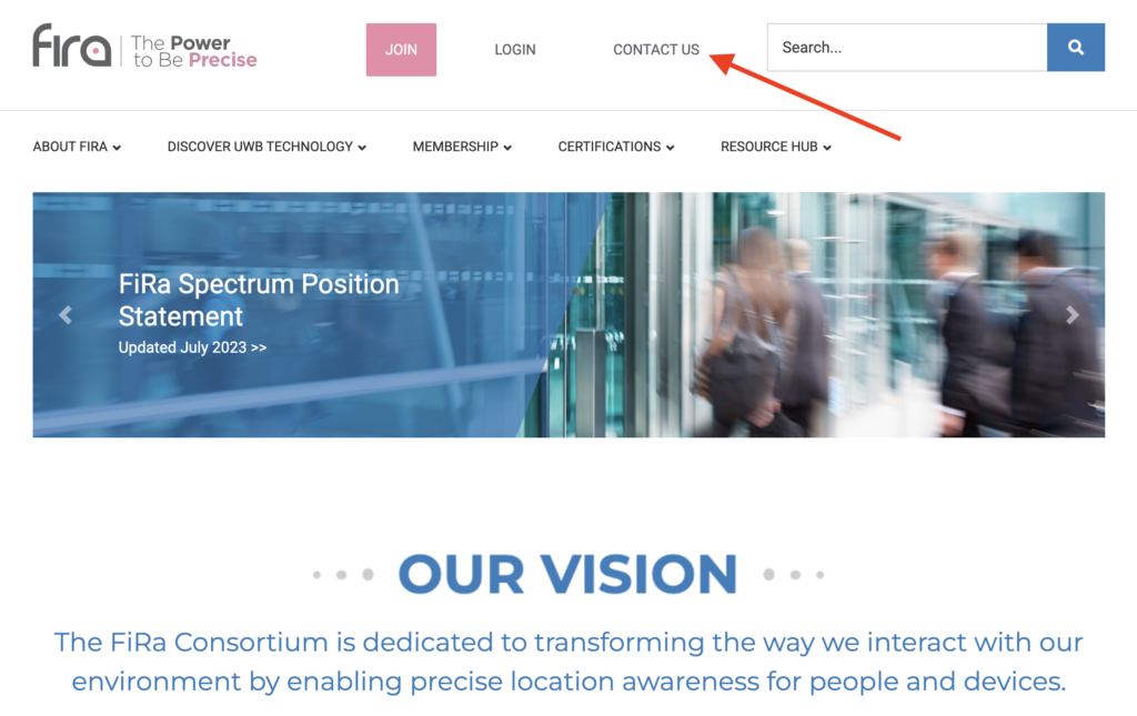
Contacting the company is made simple with a prominently placed menu item at the top of the page. The site also includes a clear call-to-action (CTA) that encourages users to “Join Us,” enabling them to become members with just one click. This seamless process lowers barriers to entry and encourages user participation.
Overall User Experience
In conclusion, Feroconsortium.org offers a lightweight and well-organized website that provides an excellent user experience. Important elements are easy to find, and the site is designed to guide users naturally through their journey. There’s no need to dig deep to find what you need—everything is readily available and easy to access.
This quick teardown of Feroconsortium.org showcases how thoughtful design and user-centric features can create an engaging and efficient online experience.
