In today’s video, we’re diving deep into an insightful teardown of the website for APPLE & BEARS Natural Sustainable Cosmetic, a brand that masterfully captures the essence of effective and sustainable web design. Our exploration begins with the site’s headline, ingeniously focused on benefits rather than features. This strategic choice immediately engages you by clearly showcasing the commitment of APPLE & BEARS to providing natural, sustainable cosmetic solutions. It answers the crucial question: “What’s in it for me?” with a powerful message about the value of eco-friendly beauty products.
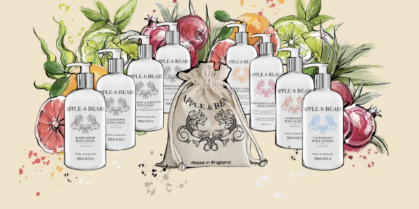
As we navigate through the homepage, you’ll be captivated by the stunning hero image that dominates the screen. This visually striking element is not just a feast for the eyes; it serves as a critical conversion tool. By encapsulating the essence and values of APPLE & BEARS Natural Sustainable Cosmetic, the hero image sets the tone for the entire user experience, making a strong first impression that encourages further exploration of their eco-conscious products.
Another standout feature of the APPLE & BEARS website is the integration of a video review section. This innovative approach significantly enhances user engagement and trust by showcasing real people sharing their genuine experiences with the brand’s natural, sustainable cosmetics. It builds credibility and fosters a personal connection with you, further amplified by the use of conversational language throughout the site. This approach breaks down barriers and makes APPLE & BEARS feel accessible and friendly, inviting you into their world of sustainable beauty.
Clarity and ease of understanding are also key strengths of the APPLE & BEARS website. The text is crafted with you in mind, using simple language and a clear structure to convey the benefits of choosing natural, sustainable cosmetic products effectively. This ensures that you can quickly grasp the value proposition and key details without feeling overwhelmed by technical jargon or dense paragraphs.
Additionally, the accessibility of contact details is a noteworthy aspect of the site. By prominently displaying ways to get in touch, APPLE & BEARS demonstrates openness and a readiness to engage with you. This not only enhances customer service but also contributes to building trust and loyalty among the user base, reinforcing the brand’s commitment to transparency and customer satisfaction.
In summary, this comprehensive overview of the APPLE & BEARS Natural Sustainable Cosmetic website reveals a meticulously designed online presence that excels in both aesthetics and functionality. The careful attention to detail in elements such as the benefit-focused headline, the compelling hero image, the engaging video content, the conversational tone, and the user-friendly text, all play a pivotal role in driving conversions. Furthermore, the easy accessibility of contact information underscores APPLE & BEARS’ dedication to transparency and customer satisfaction. Together, these elements combine to create a seamless and inviting online experience that effectively communicates the brand’s commitment to natural, sustainable beauty solutions to you.