Whether you just start out with your WordPress studies or you’ve got some experience on your hands, it really makes sense to check out top infographics about WordPress, because due to their visual nature they help comprehend some intricate WordPress notions. Apart from that, they assist with putting all your separate pieces of WordPress knowledge into one basket (not the one you put all your eggs into :)). That will give you the understanding of the whole WordPress ‘Universe” and how it’s working.
The anatomy of a WordPress theme
First off, you want to figure out how all this WordPress thing works in general. No panic. I’m not going to go into detail here and explain php coding or MySQL queries. You can just check the following infographic that gives you an idea how WordPress actually works, what components a WordPress theme consists of, etc.
Borrowed from here
WordPress plugins 101
WordPress plugins add all sorts of extra functionality to your blog. They are like gadgets for humans. The most popular plugins are for enhancing the following aspects of your site: SEO, stats, loading speed, social networking features, commenting, etc. See for yourself.
Borrowed from here
The Ultimate WordPress Cheatsheet
This infographic will be of HUGE help for those who actually create WordPress themes at the moment because it helps to check for WordPress functions and parameters in a really neat and visual way. So, if you’re a nerd (no offence :)) who makes a new WordPress theme, you might wanna grab the infographic to your hard drive or at least bookmark it.
 Ultimate WordPress Cheatsheat by Tech King
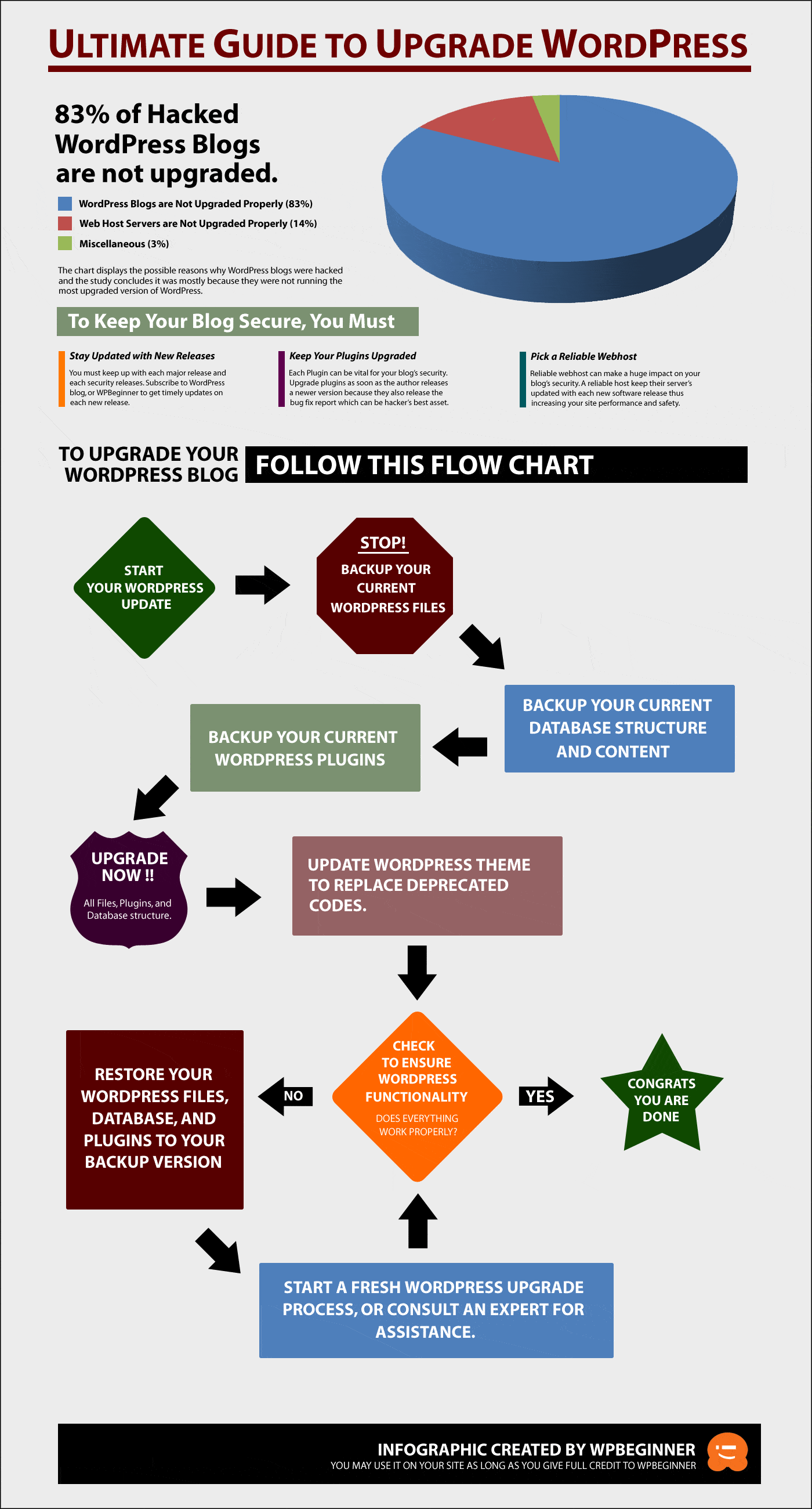
Ultimate Guide to Upgrade WordPress
Now, let’s check the infographic that explains why exactly you need to keep an eye on WordPress updates and make best use of them while they are hot. It all actually boils down to the idea that the fresher the update the more secure it is. So, you better update it right away 🙂
Borrowed from here
History of WordPress
The following of our top infographics adds some historic perspective to how WordPress was developing over the years and where it is heading to. It also offers some interesting stats (WordPress popularity, version distribution, languages of WordPress blogs, etc).
Borrowed from here
The Prolific WordPress
This one shows how many sites (and many of them are internationally known ones) use WordPress for their purposes. It also lists most used plugins, illustrates admin panel evolution, and gives the pros and cons of using WordPress.com, stand-alone WordPress or Page.ly.
Borrowed from here
Which blogging platform should you use?
In case you’re still not sure which way to go, take a look at the following top infographic, which will help to make up your mind (hint: you should use WordPress).
Infographic About the WP History
Another infographic that adds even more historic background to the development of WordPress over time.

Borrowed from here.
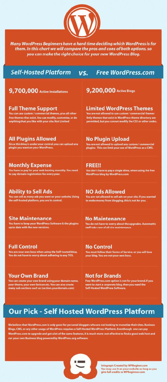
Self-hosted blog vs. WordPress.com
This one allows you to easily see the pros and cons of a stand-alone and a WordPress.com blog. It’s really up to you. For some, a stand-alone version is a must, but if you want to run sort of a hobby blog, you’ll be just fine with WordPress.com
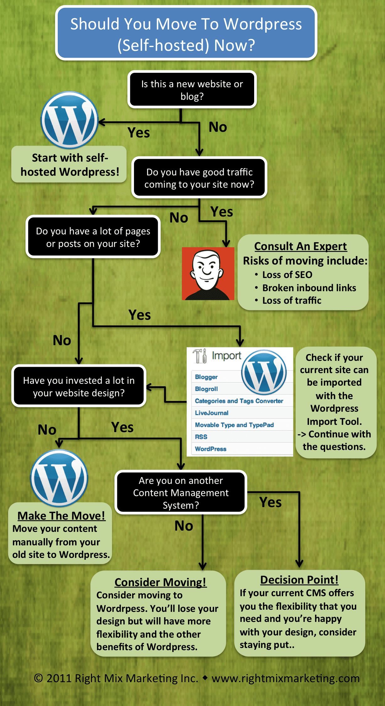
Should I Move To WordPress?
And lastly a super cool infographic that helps you decide if you need or should move to a self-hosted WordPress solution. It really depends on a bunch of factors, which are greatly depicted on the image beneath.
Borrowed from here.
So, have I and the top infographics convinced you to use WordPress? 🙂


Comments
4 responses to “Top infographics for WordPress enthusiasts”
Great collection, Kenneth. I really love infograpshics, as it’s much easier to learn some new stuff when it’s accompanied with images
Thanks, Tobias. Yeah, that’s my point (and the original purpose of infographics) that you understand stuff by far better than when you just read text wth no illustrations. As a matter of fact, that’s our human nature to crasp stuff better if it is acompanied with visuals.
As the saying goes, “A picture is worth a thousand words,” and you’ve definitely proved it with this article, Kenneth.
Thanks for your comment, Sheryl. That’s right. Infographics are great media to explain complex notions and relations between them in the form of imagery.