 In this HTML tutorial I will share some web-page design techniques and you will learn how to create web-pages with a perfect layout.
A web page design is similar to the design of usual documents for print except for a few differences. The main difference is the ability to use links. Using links (or URLs) website visitors can easily jump from one page to another looking for information that seems to be interesting. We can be so fascinated by clicking the links that we can easily get lost in cyber-space 🙂
Web page design basics
 Web designers can use lots of methods and tools to create a web page style and harmony and make the feeling that all pages belong to one website. Designing a web page you should concentrate on the emotions a visitor will feel when browsing it.
The layout elements: images, buttons, lists, lines, colors and fonts – everything must comply with the main theme and the mood of a website. Further in this HTML tutorial, we will see how the combinations of these elements can be used to achieve the most effective result.
To create an effective web page design, we should know the key differences between usual documents (for print) and web pages.
| Documents for print | Web pages |
|---|---|
| Users are getting familiar with the information in a sequential manner: from the beginning to the middle and then to the end of a document. | Using the search option or links users can go to any part of a web page right away. The only way to control such ‘jumping’ for a web page developer is to add necessary links and navigation elements (menu buttons, categories, ect). |
| Users can see the whole page including text and images (like when reading a newspaper). | If the images or videos size is too big or the browser does not support some options (like mobile browsers) users have enough time to read the text before the graphics or animation is loaded. |
| Usually serif fonts are used to display text blocks (like Times Roman) and sans-serif fonts are used for headings (like Arial). | Sans-serif fonts are used to display text blocks and serif fonts are used to display headings. |
| The user can see one page or several pages simultaneously. The page size and the amount of information are fully controlled by the author. | The user can see only a part of the web page that is displayed on the monitor. Usually, it is just several text paragraphs and depends on your monitor resolution and browser settings. |
For many years, experts in different fields of knowledge make researches looking for the most effective ways to deliver information to the audience. Here are some conclusions:
- A text in red, yellow or orange colors is the most difficult for perception. It is not recommended to use these colors for text decoration.
- The reading speed from the screen is twice lower than the usual reading speed. Taking this fact into account it is recommended to be concise and make paragraphs short separating them with images, lists and tables.
- Animation can attract the visitor’s attention but make sure it is not annoying. You should be careful using it.
- If a website visitor does not find the information he is interested in during 1 minute he will go to another website. So a well-composed website must help visitors to find necessary information fast.
Layout, content and navigation
 As I have already mentioned, website visitors read information from the screen slower than from paper documents. However there are several rules of a perfect layout that developers use to create an outstanding web page design.
Layout is a method of positioning text, graphics, videos and empty spaces designing a web page.
How to create a perfect web page layout:
- Text paragraphs must be short and have the right and left margins. A paragraph should consist of 10 lines as maximum. In the HTML tutorial 4 – CSS code we have learned how to use CSS to create margins.
- Use tables, images, headings and lists between text blocks. Visitors are more ‘scanning’ the web page than reading it until they find necessary information. And such separators as lists or headings can be useful for website visitors to find information.
- Do not underline the text if it is not a hyperlink. Users are already accustomed to the fact that any underlined text is a link. So an underlined text can be misleading if it is not a URL.
- Make sure that the main menu (navigation) is available on every page if website consists of several web-pages.
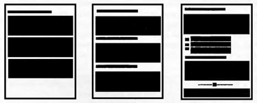
A simple text document is not interesting and cannot get website visitors’ attention.
Headings help users to find necessary info faster. However the web page design is still boring.
If you add lists, tables and images your web page design will be much more successful.


