 This is the second and the last part of my web page design tutorials. If you’ve got to our blog for the first time, I suggest checking my previous tutorials because they just give you a basic understanding and really necessary skills to proceed with your HTML endeavors. In this particular tutorial, you will learn how to set a color, size and font for text (for those who think that size actually matters :)), add images to your web page and layout them properly, and decorate your web page design with a background image. All these elements are really essential for any up-to-date site. And you want that because it’ll blow your customers’ minds when they behold such a top-notch piece of art. Let’s get the party started!
Colors and fonts
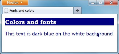
There is the <font> tag in HTML and it can be used to define the font, color and text size. However W3C standards do not recommend using the <font> tag and want us to specify text attributes within CSS instead. Let’s see how we can modify the text using CSS:
Fonts and colors
Colors and fonts
This text is dark-blue on the white background
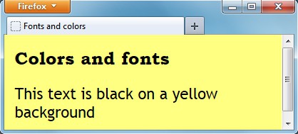
In the following example the font-color and the background properties were not specified for the <h1> tag. That is why they were ‘copied’ from the body part and applied to the <h1> heading:
![]() You can use some unique and interesting fonts while working on your web-page design. However some fonts you apply may not be installed on your visitor’s computer. That is why it is recommended to specify several alternative fonts in CSS. Also, it is recommended to use 3 different fonts (as maximum) on a web-page: one for headings, one for the main text and one for the special highlighting text.
You can use some unique and interesting fonts while working on your web-page design. However some fonts you apply may not be installed on your visitor’s computer. That is why it is recommended to specify several alternative fonts in CSS. Also, it is recommended to use 3 different fonts (as maximum) on a web-page: one for headings, one for the main text and one for the special highlighting text.
If you want to use more than 3 different fonts, then you should be careful, because in this case your web-page may (and most likely will) look messy.
Graphics and images
You should use the images that match the chosen theme (look and feel) of a particular web-site design only.
Just as a reminder: in the HTML tutorial 7 – Image in HTML we have learned how to add and align images in HTML using CSS.
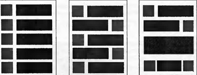
The following example will show you the optimal image position on your web-page:
If all images are located in the right or left column, a web-page will look boring and misbalanced.
Uniform images distribution on a web-page allows balancing it and looks more attractive but still can be improved.
Combining images with text blocks and empty spaces you can make a web-page look more interesting and professional.
![]() Designing a web-page keep in mind that its loading speed should be 5 seconds as maximum (the less the better actually). Otherwise it can negatively influence both your site’s usability and SEO. To reduce your site’s loading time, you can place image thumbnails on your web-page and link them to bigger images. So, web-site visitors will load the bigger image only if they are interested in it.
Designing a web-page keep in mind that its loading speed should be 5 seconds as maximum (the less the better actually). Otherwise it can negatively influence both your site’s usability and SEO. To reduce your site’s loading time, you can place image thumbnails on your web-page and link them to bigger images. So, web-site visitors will load the bigger image only if they are interested in it.
Background images
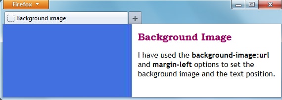
We have already learned how to set the background color. Also we can use any images as our web-page background. Let’s see how it can be done with the following example:
Background image
Background Image
I have used the background-image:url and margin-left options to set the background image and the text position.
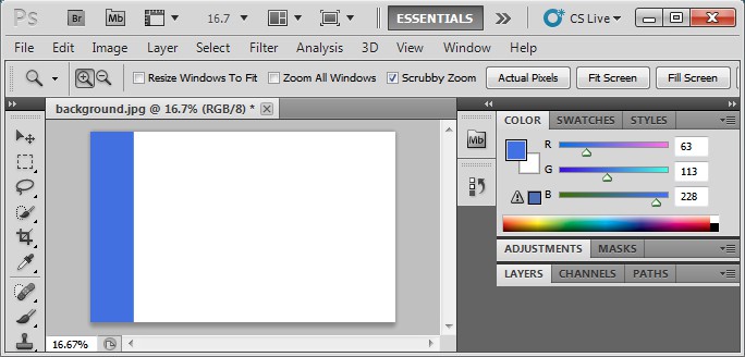
The background.jpg file is just 40kb so it will load very fast. I have created it in Photoshop by drawing a simple blue rectangle on a white sheet.
Let me explain the above example in more detail:
- The background-image:url(URL of the image file goes here) declaration tells the browser where the background image file is located.
- The background-position:top left declaration defines the background image position. First, the vertical position is specified – it could be top, bottom and center – and then the horizontal position: left, right, center.
- The background-repeat tag defines if the background image should repeat and take all the space on the screen or be applied only once.
- The margin tag defines the border width and location, it could be: margin-right, margin-left, margin-top and margin-bottom. If I did not specify the margin-left:250px, the blue line would be covered by the text. The text is left aligned by default.
I hope that you have enjoyed the web page design HTML Tutorial. Please do not hesitate to leave your comments below 🙂
Thank you for your attention and have great spring holidays!

