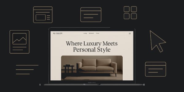
A short tour of the site’s design, tone, navigation, and how it makes shopping for furniture simple and enjoyable.
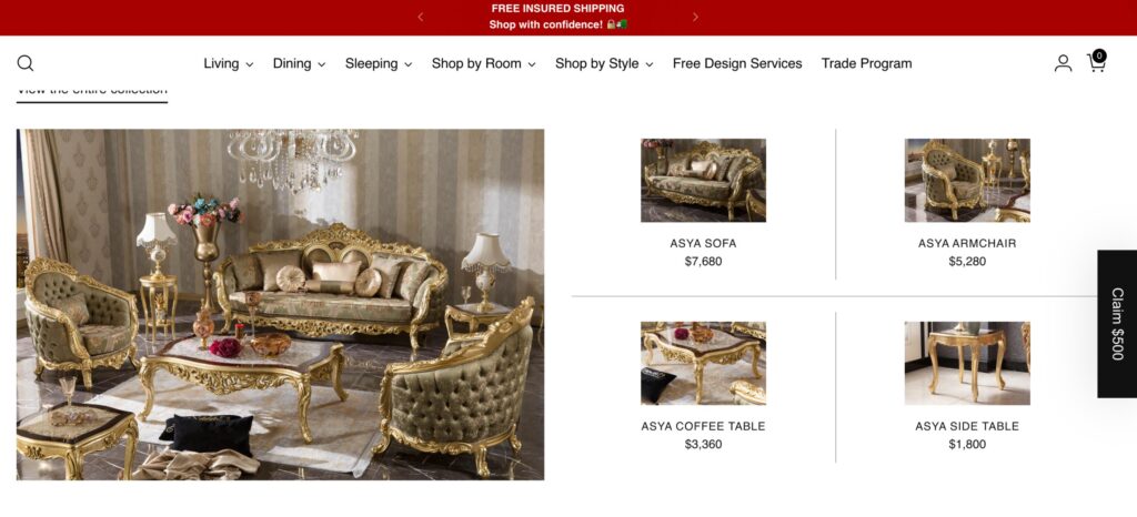
1. First Impressions Matter
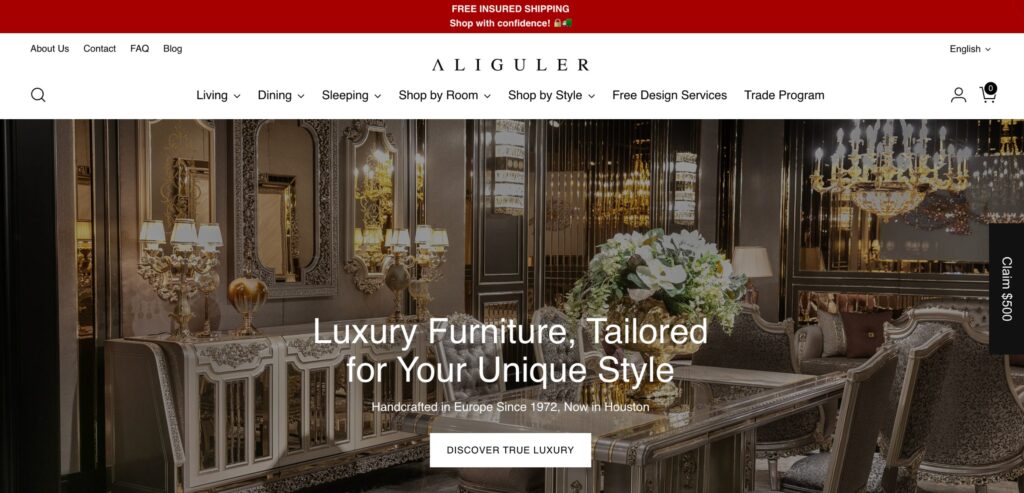
When you arrive at AliGulerFurniture.com, you’re welcomed by a clean and visually compelling homepage. A bold, benefit-focused headline tells you immediately what the brand offers, while a stunning hero image showcases beautiful furniture that reflects both quality and style. Right away, the site establishes a premium but approachable feeling that invites you to explore more.
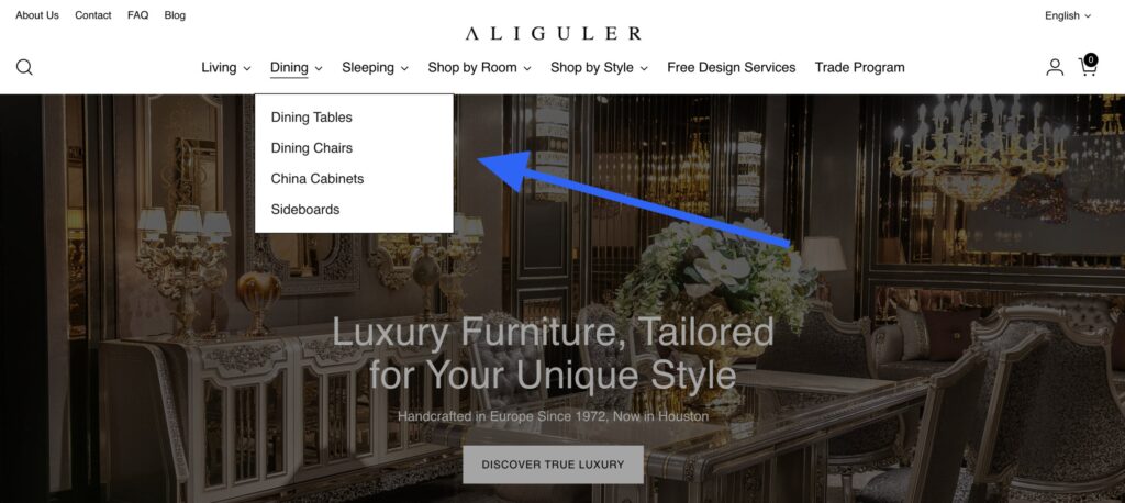
2. Design That Puts You First
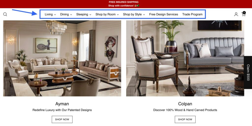
The website is thoughtfully designed with the user in mind. Every element—from buttons to product categories—is positioned for effortless browsing. The layout is clean and uncluttered, allowing you to focus on products and details without distraction. Whether you’re browsing on a phone, tablet, or desktop, the site adapts smoothly to ensure a comfortable experience.
3. Trust Through Social Proof
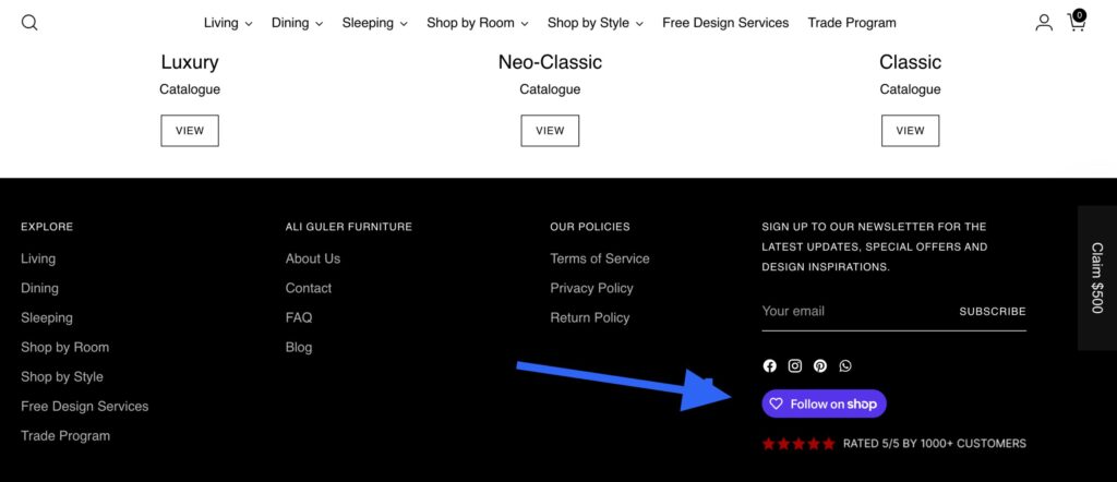
AliGulerFurniture.com highlights its strong reputation with a 5/5 rating from over 1,000 customers. This visible proof of satisfaction, along with active social channels and a clear brand voice, helps build confidence and trust among new visitors.
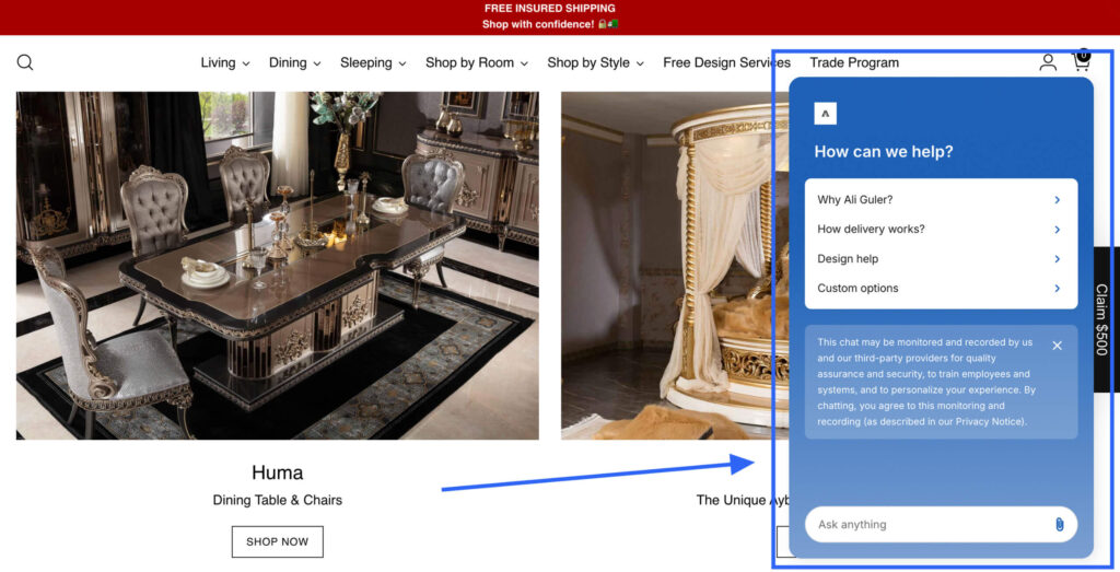
4. Easy Ways to Connect
Connecting with the team is straightforward. The site offers live chat and options to schedule a video call for personalized assistance. Whether you need help choosing a sofa size, understanding delivery options, or requesting a customization, support is just a click away.
6. A Seamless Buying Experience
Purchasing is designed to be quick and stress-free. Clear product descriptions, transparent pricing, and a simple checkout flow remove friction from the buying process. Whether you’re a first-time buyer or returning customer, the entire journey—from discovery to delivery—is secure and straightforward.
Conclusion: Built for Your Best Experience
Overall, AliGulerFurniture.com delivers a well-rounded user experience that balances beauty, clarity, and convenience. From striking visuals and clear messaging to helpful social proof and easy ways to get support, the site is crafted to guide you confidently toward the right choice. We invite you to explore the site, discover your style, and enjoy a smooth shopping experience.