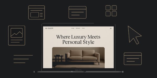
A short tour of the site’s design, tone, navigation, and how it makes shopping for furniture simple and enjoyable.
1. First Impressions Matter
When you arrive at AliGulerFurniture. (more…)
A short tour of the site’s design, tone, navigation, and how it makes shopping for furniture simple and enjoyable.
When you arrive at AliGulerFurniture. (more…)

In this quick teardown of AttuneConnect.com, I’ll highlight some of the key features that make this website both effective and user-friendly. Let’s dive into the design elements, user experience, and how well the site is optimized for performance and search engines.
(more…)
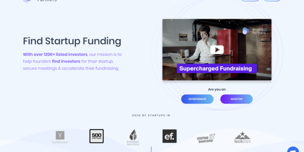
In this blog post, we’ll be conducting a thorough teardown of the Angels Partners website, located at AngelsPartners.com. We’ll explore the site’s various elements, including its headline, design, social proof, and overall user experience.
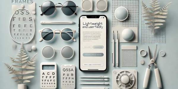
In today’s digital landscape, having a website that not only looks good but also performs efficiently is essential. ossaframes.com is an excellent example of a site that strikes a balance between aesthetics, user experience, and functionality. Here’s a quick breakdown of what makes this website stand out.

In this quick teardown of the FiRaConsortium.org website, I want to highlight several key features that contribute to its excellent user experience and interface design. This site exemplifies how to create a smooth, intuitive, and user-focused web experience.

In this post, I’d like to tear down a site that provides healthcare IT support. Firstly, I’m going to share what first reactions and impressions I got on the positive site (what the site is doing really right) and then I’m going to mention what can potentially be improved on the site from a usability standpoint. Well, let’s get the ball rolling 🙂 (more…)