In today’s digital landscape, having a website that not only looks good but also performs efficiently is essential. ossaframes.com is an excellent example of a site that strikes a balance between aesthetics, user experience, and functionality. Here’s a quick breakdown of what makes this website stand out.
Would you rather watch a quick video, here you go 🙂
1. Benefit-Focused Headline
One of the first things that grab your attention on ossaframes.com is the benefit-focused headline on each slide. This approach is effective because it immediately communicates the value proposition to the user. By focusing on what the customer gains, the site hooks visitors right from the start, encouraging them to explore further.

2. Lightweight Design
In the age of mobile-first indexing, having a lightweight design is crucial. ossaframes.com excels in this area, offering a streamlined, fast-loading experience that caters to users on mobile devices. Given that Google now uses the mobile version of a site as the primary one for indexing, a lightweight design is not just a bonus—it’s a necessity. ossaframes.com’s attention to this detail ensures that it performs well in search rankings and provides a seamless experience for users, regardless of the device they’re using.

3. Effective Use of Conversational Language
The site’s use of conversational language is another highlight. This approach not only makes the content more relatable and engaging but also enhances the user experience. Additionally, conversational language is beneficial for voice search, which is becoming increasingly popular. By adopting this tone, ossaframes.com positions itself to be easily accessible via voice commands, adding to its overall usability.

4. Prominent Contact Information
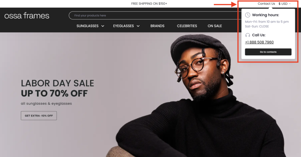
Ease of contact is vital for any website, and ossaframes.com makes it simple for users to get in touch. The contact details are prominently displayed, ensuring that visitors can quickly find the information they need to reach out. This transparency builds trust and encourages user interaction, which is crucial for customer satisfaction and conversion rates.

5. Strategic Call-to-Actions
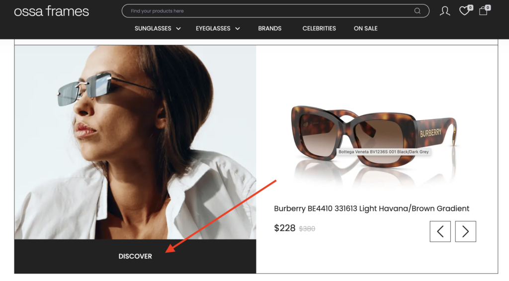
Call-to-actions (CTAs) are strategically placed throughout the site, guiding users towards key actions like discovering more about the lenses or purchasing a product. These CTAs are designed to drive conversions by making it clear what the next step should be, whether it’s learning more or making a purchase. The frequent and visible CTAs ensure that potential customers are constantly reminded of their options, leading to higher engagement and, ultimately, more sales.

Conclusion
All in all,ossaframes.com is a well-crafted website that excels in both design and functionality. Its lightweight design, benefit-focused headlines, conversational language, prominent contact details, and strategic CTAs come together to create a user-friendly site that not only attracts visitors but also converts them into customers. If you’re looking for a model of a modern, efficient, and effective website, ossaframes.com is definitely worth a look.
