SEO logo creation can be a daunting task if you do it wrong. I finally made up my mind to have a logo created for my site (WebDesy.com), because the one that I had before was really lame. I just wanna share my experience, because I spent a whole lot of time investigating how to do it right. What’s really cool is that once I got a really professionally looking logo, I started getting more customers for my SEO services (content promotion and guest blogging). I guess it’s because if you have a decent logo your whole site starts looking in a totally different way. So, I highly encourage having a logo created for your site rather than making one on you own.
Just take a look at my previous logo and my new one so that you can see the HUGE difference. Here’s the one I made on my own:

And the NEW one!

As you can see, the one I made on my own is just a flop for lack of a better word. And to top it all, it looks really ragged even before zooming in. Now let me explain how I got my brand new logo that changed the way I work online.
How to Find a Logo Designer
I personally think that you need to check back with your friends and acquaintances if they know a nice designer, because doing so will ensure that they’ll provide you with a top-notch quality job. The reason is that you don’t want to give something sucky to the people that are friends of your friends. Does that make sense?
So, I just contacted a dude who is a designer. He was not actually good for the job, because he did not work with vector graphics, but he suggested me another dude who was a logo guru. That is the guy who actually created my logo. What I’m trying to say here is that it really makes sense to leverage your friends in case you need some kind of services. They may know somebody who can help you.
In case you can’t find a designer that your friends know, you can ask them which services they recommend.
How to Talk to a Designer
You need to write a brief for your designer. A brief is a text file where you describe in general what kind of logo (or any other) design you need. You can use it to specify the guidelines that your designer should follow and the constraints he should keep in mind while creating your SEO logo. I call the logo an SEO one because I assume you’re an SEO just like me, but the content of the post holds true for any person ordering a logo from a web designer.
Logo Objectives
First off, you need to specify what idea the logo should convey. In my case, the idea is that my logo should show the quality and reliability of my content promotion services. Just take a look at the logo.

The arrow pointing upwards demonstrates that my services help achieve better results, higher rankings in my particular case. The blue color conveys the idea of reliability. So, the designer did pretty well, because he created exactly what I described in my brief to him.
You also want to give him your site address so that he can see the overall design that your site has, because it’ll help to create a logo that looks naturally in your site’s design (using the same color palettes and design techniques). Again, the logo I got from my designer looks like it was always there, right from the gitgo.
And one more thing about the overall design of your logo. If you have distinct dislikes in terms of design styles, you definitely need to talk about it with your designer beforehand just to make sure that he won’t use it for your logo. Doing so helps both you and the designer save your time.
Budget
Though money can be really tricky in this situation, I really encourage you to tell your designer what kind of budget you have on hands, because it’ll guarantee that you get a high-quality result. Sure thing, you should not try to save money on your logo, because it’s the image that you’ll use in many places and for multiple purposes. So, your logo should look as professional as possible. If you pay decent money for a logo, your designer will do his best to get back to you with the best quality possible, because, being in the know what kind of money he gets, he’ll be able to tailor his schedule the way that benefits you BEST.
Schedule
You also need to specify your deadline so that your designer can reschedule if necessary. You may want to specify whether your deadline is fixed (an event, site launch or what not) or flexible so that he can tell you if he needs more time.
I strongly recommend striving for quality rather than meeting deadlines. It goes without saying that you do need to do some things on time, especially if you need your logo for a specific date or event, but, as a rule of thumb, you need to give your designer all the time it takes to create the seo logo design your competitors will be envious with.
Target Audience
Also, you want to specify what kind of audience your site has so that the designer can apply appropriate design approaches to your logo. For example, if your target audience is teenage girls, the logo will be tailored to their likings. In case it’s some corporate audience, your logo design will be more business-like. In a nutshell, your designer should know who your site is geared towards. Knowing that will help him not disappoint neither you nor your audience.
What You Want in a Logo?
OK, you know how to provide your logo designer with the info he may need for creating your logo. But how do you know what YOU want?
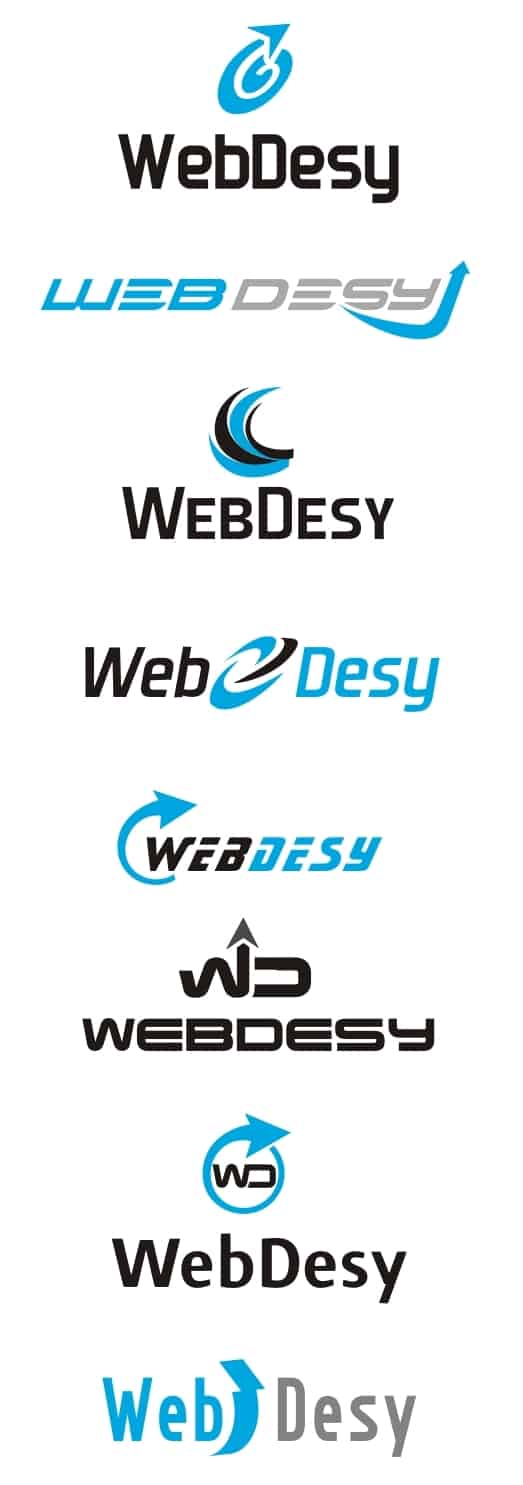
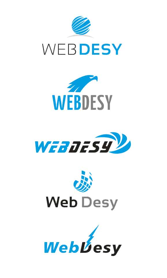
First up, let me show you what sketches my designer sent me after a few days so that I can choose the one I like most.


Now we’ll go through each principle that you need to keep in mind and see which logos meet those requirements.
KISS
Though your SEO company logo should speak the idea that you want to demonstrate, it should also be really simple, because you don’t really have that much space on your site for a large logo. Plus you want it to be simple so that the visitor can easily memorize it and recall when he sees it somewhere else down the road. Well, all the logos above seem to meet that requirement. I guess it’s because, in the very beginning, I told my designer that I want something similar to the Nike logo (in the ideal situation).
Scalability
Since I may want to use my search engine optimization logo on all sorts of objects, both on-line and off-line, I wanted something that can be resized (scaled) to my heart’s content and still remain usable and memorable.
Just take a look at the three versions of my logo.


Whichever size you look at you still can guess the brand. That’s what I call logo scalability.
What’s more, the fact that my logo is memorable at multiple sizes came in handy when I decided to launch a podcast, because one of the requirements that iTunes has for podcast thumbnails is that they should look good at 50px/50px. And my logo seems to fit the bill just right. Kudos to the logo designer.
Fonts
Some designers don’t really recommend using your company name as a logo component because when zoomed out, it’ll be hard to see the wording. In my particular case, the logo itself (the blue abbreviation) can be easily used separately from the wording, which represents my website directly. See below

Should you want to use your wording at all times, make sure that you don’t use more than 2 different fonts. As a matter of fact, it also holds true regarding your overall site design. Using just a few fonts emphasizes the consistency of your site design and shows your professionalism.
Color
Your color palette should be consistent as well. So, like I said above, you want to send your site address (or the design your other design team is working on) to your logo designer so that he can see the overall site design and the colors being used.
I personally just told my designer to use 2-3 colors (blue & grey), which are basically the colors that my design already has. Since I wanted the blue to be exactly as the menu buttons have (on roll over), I specifically told him that.
Also, your logo should look ok when you use it in black and white. You need that feature in case you decide to print it on something that does not allow colorful images. In my humble opinion, this logo looks just about right in black and white. Right?

Logo Version Selected
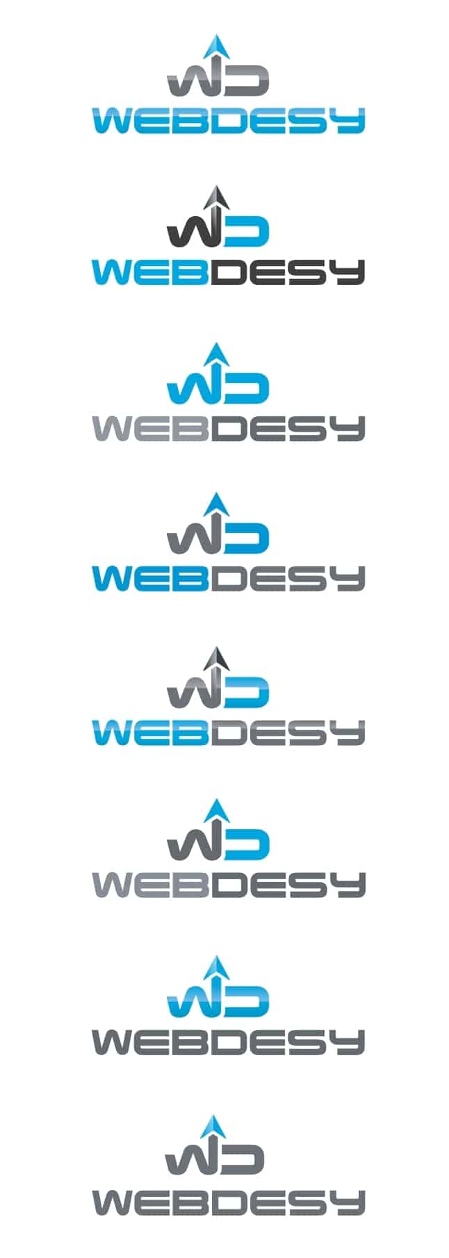
As you might have guessed, that’s exactly the sketch that I chose for my would-be logo. I just asked my logo designer to play around with the colors (blue and grey) just a bit in order to see which color combination works best and remains consistent at the same time. It’s not really that difficult to change colors for me, but I just wanted him to offer what he, as a designer, considers best for my search engine optimization logo. Here’re what he got back to me with.

I really liked the third to last logo, but I also wanted him to change the color of the curly W to blue. And here’s the final version that I got.

It meets pretty much all the requirements for a professional logo. It looks decent when zoomed in or out, it’s stylish in black and white, the colors and style are consistent with my overall site design. Long story short, it’s a rock solid seo logo for professional services.
Quick Tips
[list type=”star”]
- make sure that your designer sends you the logo in vector format because it’ll allow you to resize it as you see fit
- also, make sure that he provides you with the font used in the logo, because you may want to change something down the line
- tell your designer that you expect a few designs (sketches) so that you can take a look at them and choose the best one. Being a pro, your designer should take it for granted, but if you work with him for the first time it won’t hurt to make sure that you’re on the same page.
[/list]
In Conclusion
You definitely need to have a professional logo created for you site, because it’ll change what visitors (potential customers) think about your site and services. The logic is as follows. If the design is awesome, so should be the services the site offers. And if you have a poorly-designed site, people will turn down all the offers you have just because of that.
Get ready to pay good money for your logo so that people start seeing your site as a professional one. And if they do, they are way more likely to buy services from you.
What kind of experience did you have ordering a logo for your site? Anything worth sharing here?